Facciate di case contemporanee di medie dimensioni
Filtra anche per:
Budget
Ordina per:Popolari oggi
1 - 20 di 25.942 foto
1 di 3
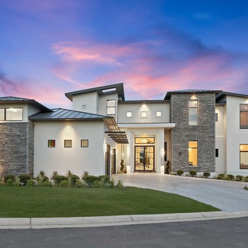
Foto della villa bianca contemporanea a due piani di medie dimensioni con rivestimento in stucco e copertura in metallo o lamiera
At Murakami Design Inc., we are in the business of creating and building residences that bring comfort and delight to the lives of their owners.
Murakami provides the full range of services involved in designing and building new homes, or in thoroughly reconstructing and updating existing dwellings.
From historical research and initial sketches to construction drawings and on-site supervision, we work with clients every step of the way to achieve their vision and ensure their satisfaction.
We collaborate closely with such professionals as landscape architects and interior designers, as well as structural, mechanical and electrical engineers, respecting their expertise in helping us develop fully integrated design solutions.
Finally, our team stays abreast of all the latest developments in construction materials and techniques.
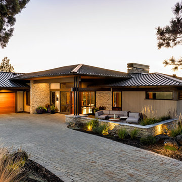
Idee per la villa beige contemporanea a un piano di medie dimensioni con rivestimenti misti, tetto a padiglione e copertura in metallo o lamiera
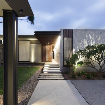
Ispirazione per la facciata di una casa beige contemporanea a due piani di medie dimensioni con rivestimenti misti e tetto piano
Design by Vibe Design Group
Photography by Robert Hamer
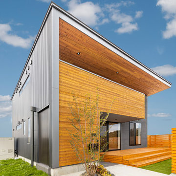
Idee per la facciata di una casa marrone contemporanea a due piani di medie dimensioni con rivestimento in legno e tetto piano
Idee per la facciata di una casa marrone contemporanea a due piani di medie dimensioni con rivestimento in legno e tetto piano
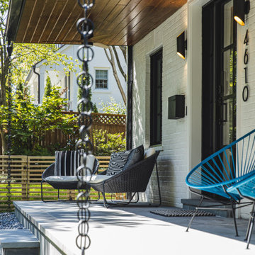
Exterior addition to front elevation to an existing ranch style home.
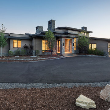
Foto della villa grigia contemporanea a un piano di medie dimensioni con rivestimenti misti, tetto a capanna, copertura a scandole e tetto nero
Foto della villa grigia contemporanea a un piano di medie dimensioni con rivestimenti misti, tetto a capanna, copertura a scandole e tetto nero
Foto della villa verde contemporanea a un piano di medie dimensioni con rivestimento in mattoni, tetto a padiglione, copertura a scandole e tetto grigio
Ispirazione per la facciata di una casa nera contemporanea a due piani di medie dimensioni con rivestimento con lastre in cemento, tetto nero e pannelli sovrapposti
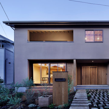
写真撮影:繁田 諭
Esempio della villa marrone contemporanea a due piani di medie dimensioni con tetto a capanna, copertura in tegole e tetto nero
Esempio della villa marrone contemporanea a due piani di medie dimensioni con tetto a capanna, copertura in tegole e tetto nero
FineCraft Contractors, Inc.
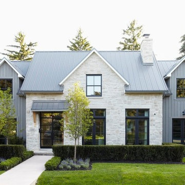
Idee per la villa bianca contemporanea a due piani di medie dimensioni con rivestimento in mattoni, falda a timpano, copertura in tegole e tetto grigio
Idee per la villa bianca contemporanea a due piani di medie dimensioni con rivestimento in mattoni, falda a timpano, copertura in tegole e tetto grigio
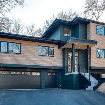
New multi level home built after existing home was removed. Home features a contemporary but warm exterior and fits the lot with the taller portions of the home balancing with the slope of the hill. Paint color is Sherwin Williams Jasper. Cedar has a tinted gray/brown stain. Posts and soffits are black.
Front facade design
Esempio della facciata di una casa bianca contemporanea a due piani di medie dimensioni con rivestimenti misti, copertura a scandole e tetto grigio
Esempio della facciata di una casa bianca contemporanea a due piani di medie dimensioni con rivestimenti misti, copertura a scandole e tetto grigio
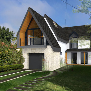
Foto della villa bianca contemporanea a tre piani di medie dimensioni con rivestimenti misti, tetto a capanna, copertura in tegole e tetto nero
Idee per la facciata di una casa nera contemporanea a due piani di medie dimensioni con rivestimenti misti e copertura in metallo o lamiera
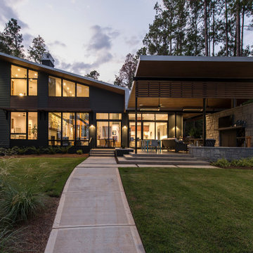
We designed this 3,162 square foot home for empty-nesters who love lake life. Functionally, the home accommodates multiple generations. Elderly in-laws stay for prolonged periods, and the homeowners are thinking ahead to their own aging in place. This required two master suites on the first floor. Accommodations were made for visiting children upstairs. Aside from the functional needs of the occupants, our clients desired a home which maximizes indoor connection to the lake, provides covered outdoor living, and is conducive to entertaining. Our concept celebrates the natural surroundings through materials, views, daylighting, and building massing.
We placed all main public living areas along the rear of the house to capitalize on the lake views while efficiently stacking the bedrooms and bathrooms in a two-story side wing. Secondary support spaces are integrated across the front of the house with the dramatic foyer. The front elevation, with painted green and natural wood siding and soffits, blends harmoniously with wooded surroundings. The lines and contrasting colors of the light granite wall and silver roofline draws attention toward the entry and through the house to the real focus: the water. The one-story roof over the garage and support spaces takes flight at the entry, wraps the two-story wing, turns, and soars again toward the lake as it approaches the rear patio. The granite wall extending from the entry through the interior living space is mirrored along the opposite end of the rear covered patio. These granite bookends direct focus to the lake.
In brief
Location, location, location
When looking for your perfect home where you can put down your grass roots and start a family there are many ‘must haves’ that we all have on our wish lists. The obvious contenders are price and location with many other niceties, like the number of bedrooms, layout and decor taking a back seat. As we all know, location can sell a home to those who strive to be in the right area, for transport links, local amenities and the all-important school catchment areas.
Like many other families throughout the UK our clients chose their house for its excellent location. Just ten minutes from the centre of Stafford by car, our client’s house is in a popular and sought-after suburb of the town for couples and families alike. They have always loved the location of their house for its easy access to work, schools, leisure facilities and social connections, but they were becoming increasingly frustrated with the layout of the ground floor of their home.
It’s inevitable that families will evolve and our needs from our properties will change too. Since the young family of four moved to their large four-bedroom detached house a few years ago, their property has been unable to meet their lifestyle needs and living patterns.
Although their property has adequate bedroom space for them and their two children, the layout of the downstairs living area was not functional and it obstructed their everyday life, making entertaining and family gatherings difficult.
Our First Meeting
Upon our initial consultation with our clients it was clear from the outset why they sought to make changes to the layout of their house. The property had been extended to create extra space by the previous owners, but unfortunately the design and build hadn’t been executed well at all. The rooms and layout were awkward in size and shape and it didn’t allow the family to come together and enjoy their home. They had the floor space, but it was sectioned off into separate rooms, some without a purpose.
The garden surrounds the house on all three sides and is of a good size in its entirety with different areas on each aspect. We could clearly see that the house itself didn’t address any particular aspect of the garden in any way.
Moving to a new house wasn’t an option, the family were happy with the location and size of the property. What they wanted was a modern, functional, stylish space for everyday family life, with the flexibility to accommodate their large extended family when needed and to ultimately add value to their property.
We were appointed by our clients to create a design solution to redesign the ground floor living area with a modern, light filled, open plan space that connects with the garden. It was clear from outset that our design intention was to break down the room barriers and to respond to the needs of the family, supporting their lifestyle now and for the future, bringing them together and creating a house they could call a home.
Delivering a project on time and within our client’s budget are always a top priority for our team. The family decided to stay in their house during construction, therefore it was even more essential to minimise the level of disruption to their daily lifestyle with a young family living on site.
The family needed help from our team at Croft Architecture to swiftly and successfully acquire Building Control Approval for their project to progress rapidly, ensuring project completion on time and to their determined budget.
Our Approach
Surveying the site
The client’s home is located on the entrance to a quiet cul-de-sac on a mature, leafy, suburban housing estate. Their home nestles into its well-established site, with ample space between the neighbouring properties and has considerable garden space to the rear and both sides.
During our initial visit we spent a long time with the family observing the existing layout, talking about how they currently live in the property, their annoyances with the house in its current form, how they would like to be able to live in their family home and how they aspired it to feel, look and live.
We walked through the house and it was clear that the existing layout didn’t work downstairs. The house had been extended onto before they had bought the property and the space hadn’t been well thought through in terms of how it would be used effectively.
The rooms directly to the left off the hallway, didn’t really have a proper function. The previously extended space had resulted in the house with too many rooms and subsequently this had led to a series of impractical spaces.
The long and narrow extension was home to a small U-shaped kitchen at the front of the house, which led onto the dining area and then onto a small room at the back of the extension. For the size of the house the kitchen and dining room in a much smaller and narrower area, leaving larger living areas to the rear of property with copious amounts of dead space. The small kitchen was tucked away at the front of the property which made life difficult for our clients to observe their children playing safely in the garden whilst preparing food and carrying out work in the kitchen. On the opposite side of the property there was another old extension which had a step down into it. This living area had a tiled floor and large glazed windows on all sides which made it feel almost like a conservatory.This area was rarely used by the family as it had no real function, plus it was hot in the summer and cold in the winter. It had become an under utilised space.
We walked around the property and it was clear that the house itself didn’t address their private garden space to any particular aspect in any way, meaning that the garden space was under used because of the poor connections.
The family wanted a combined kitchen, dining, lounge space for daily life and also for entertaining their family.
Design Approach
The size of the property presented the opportunity to substantially reconfigure the family home to create a series of dynamic living spaces oriented towards the large, south-facing garden.
Our team suggested removing the little kitchen from the front of the property and re positioning it within the unused glazed space at the back of the house.
The glazed room had internal French doors with a step down into the space separating it from the lounge. We proposed to remove the French doors, level the floor and make it into one room with the existing lounge.
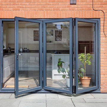
To connect the new open plan kitchen and living space to the rear and side garden sliding and folding doors were the solution, extending the family’s usable living space by creating a seamless indoor-outdoor flow. There was already a patio area there and it made sense for the kitchen to move to the rear of the house to be close to the patio for easy outside dining.
It was therefore logical to retain the existing living space in it's current location next to the new kitchen, maintaining the natural flow of the house for the family after eating and entertaining in the kitchen.
When making decisions regarding the kitchen design, we worked closely with the family. They thoroughly enjoy spending time cooking and entertaining with their large extended family. To assist with their culinary preparations our clients had aspired to have an induction hob within their new kitchen. As they were working through the design with us, they weren’t sure about an induction hob because of different cooking methods required for certain meals that they like to produce. They particularly like making chapatis which require a round pan and a gas hob. We didn’t see this as a problem and suggested having a single gas burner for purely this purpose whilst still installing an induction hob. They decided to go ahead with our idea, choosing a single gas burner and an induction hob, and it looks great!
The existing lounge space had a corner aspect at the rear property that protruded into the garden. Positioned next to the kitchen and dining space it seemed logical to us for the living area to also open out onto the patio, thus connecting the garden to the house on a wider aspect. To enhance the connection between the garden and the living room we thought that a corner door would work extremely well to really open up this space. The clients really liked the design concept to create a feature of the corner with glazed sliding doors that would completely open the house up to the garden. They were excited about the prospect of the allowing huge amounts of natural light into their home and the flexible access it would provide to the garden.
Once the new kitchen, dining and living space had been concluded, we then had to consider what the previous kitchen and dining area was going to be used for within the small, long side extension. We talked with our clients about a few possible uses. We noticed that the family have a piano and few other musical instruments. It made sense for this space to become a quiet part of the house for them to escape to, play music, read and generally relax in a snug area.
To shorten the length of the new music room and make an additional feature in the newly created open plan kitchen, dining and living area, we reclaimed some of the space from the back of the side extension and opened it up to the main open-plan space, thus creating another new snug. We added an additional design feature within the snug by creating a timber window seat. Not only does it provide extra seating, but it’s also created a snug within a snug, a haven for reading, napping and gazing out into the garden.
As part of their brief our clients also wanted a to incorporate a log burner into their newly remodelled home. To connect the new music room and snug to the living space we proposed to position a two-way log burner where the existing gas fire was located. By retaining a fire in the original location it would minimise the disruption and work required to install the wood burner. However, the theory didn’t turn into reality and the new fire resulted in being quite a task to get it to work. When the contractor began to strip back the existing fireplace, they discovered that fitting the pipe within the building was going to be more challenging than they anticipated because of the poorly constructed extension. It was difficult to execute but it was ultimately achieved.
What lies beneath?
It’s not until you uncover the fabric of the building that you fully understand what’s going on underneath. When the contractor exposed the structure of the house, we found out that the property had been poorly constructed, and they uncovered a lot of poor workmanship from the original builders. As the build progressed the inner skin of the extended structure was exposed, we found that it wasn’t actually strong enough and we needed to make it safe in order to proceed. Going forwards we ensured that the structure was safe, and all issues were identified and immediately rectified.
The previous extensions to the house also presented further challenges as the build progressed. We found that the floors between rooms were not level. We wanted to create the appearance of one space rather than lots of chopped up areas. To do so we needed to alter the floor and ceilings to ensure that they were flush right through the new open plan living space. Also, after removing the internal French doors, the down-stand beam where the doors had previously been were subsequently left prominent down from the ceiling. The design required careful planning and attention to detail to achieve the best looking finished results for the client.
For us, in principle our clients’ scheme at the outset was quite a simple project but when the strip out commenced there was actually a more going on underneath that needed attention before the project could start to take shape. A lot of things needed to be considered to make it work structurally and properly for the family.
When the carpet was initially lifted, we found a parquet floor underneath. The family and our team were extremely excited at the prospect of having a traditional parquet floor that could be sanded down and made good. However, when ‘all’ of the carpet was removed only half of the living room had been covered in parquet flooring and the other half was actually a solid concrete floor. Unfortunately, we couldn’t proceed with the flooring and our clients chose another floor finish.
Making connections
Our team at Croft Architecture have created a new, sleek, spacious family ‘hub’ that’s light with clean lines. The open plan space unites the family of four whilst providing the ability to gather the wider family and seamlessly connecting their home with the garden through the new full length sliding doors. Although they now have plenty of space to gather with the family, they also have areas of seclusion to spread out and escape to when needed.
A strong working relationship between our team, the client and Building Control enabled us to gain the necessary permissions promptly. We enjoyed working with the project team and we’re extremely pleased to successfully deliver the completed project. Although it wasn't in accordance with our client’s timescales with the discovery of hidden structural challenges, we spent the time carefully resolving the issues to unsure that our clients home was not only safe, but also looks great and functions perfectly.
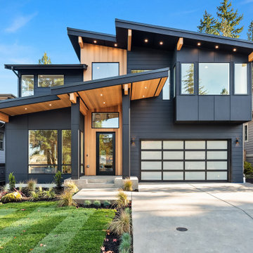
The Project brief for this job was to create a modern two-storey residence for their family home in South Perth. Brad was after a clean contemporary look. We kept the form quite simple and standard to ensure building costs were low, however we incorporated feature piers and stepped the facade cleverly to produce a great looking property.
Exterior - Front Entry
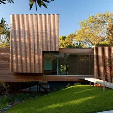
Beach House at Avoca Beach by Architecture Saville Isaacs
Project Summary
Architecture Saville Isaacs
https://www.architecturesavilleisaacs.com.au/
The core idea of people living and engaging with place is an underlying principle of our practice, given expression in the manner in which this home engages with the exterior, not in a general expansive nod to view, but in a varied and intimate manner.
The interpretation of experiencing life at the beach in all its forms has been manifested in tangible spaces and places through the design of pavilions, courtyards and outdoor rooms.
Architecture Saville Isaacs
https://www.architecturesavilleisaacs.com.au/
A progression of pavilions and courtyards are strung off a circulation spine/breezeway, from street to beach: entry/car court; grassed west courtyard (existing tree); games pavilion; sand+fire courtyard (=sheltered heart); living pavilion; operable verandah; beach.
The interiors reinforce architectural design principles and place-making, allowing every space to be utilised to its optimum. There is no differentiation between architecture and interiors: Interior becomes exterior, joinery becomes space modulator, materials become textural art brought to life by the sun.
Project Description
Architecture Saville Isaacs
https://www.architecturesavilleisaacs.com.au/
The core idea of people living and engaging with place is an underlying principle of our practice, given expression in the manner in which this home engages with the exterior, not in a general expansive nod to view, but in a varied and intimate manner.
The house is designed to maximise the spectacular Avoca beachfront location with a variety of indoor and outdoor rooms in which to experience different aspects of beachside living.
Client brief: home to accommodate a small family yet expandable to accommodate multiple guest configurations, varying levels of privacy, scale and interaction.
A home which responds to its environment both functionally and aesthetically, with a preference for raw, natural and robust materials. Maximise connection – visual and physical – to beach.
The response was a series of operable spaces relating in succession, maintaining focus/connection, to the beach.
The public spaces have been designed as series of indoor/outdoor pavilions. Courtyards treated as outdoor rooms, creating ambiguity and blurring the distinction between inside and out.
A progression of pavilions and courtyards are strung off circulation spine/breezeway, from street to beach: entry/car court; grassed west courtyard (existing tree); games pavilion; sand+fire courtyard (=sheltered heart); living pavilion; operable verandah; beach.
Verandah is final transition space to beach: enclosable in winter; completely open in summer.
This project seeks to demonstrates that focusing on the interrelationship with the surrounding environment, the volumetric quality and light enhanced sculpted open spaces, as well as the tactile quality of the materials, there is no need to showcase expensive finishes and create aesthetic gymnastics. The design avoids fashion and instead works with the timeless elements of materiality, space, volume and light, seeking to achieve a sense of calm, peace and tranquillity.
Architecture Saville Isaacs
https://www.architecturesavilleisaacs.com.au/
Focus is on the tactile quality of the materials: a consistent palette of concrete, raw recycled grey ironbark, steel and natural stone. Materials selections are raw, robust, low maintenance and recyclable.
Light, natural and artificial, is used to sculpt the space and accentuate textural qualities of materials.
Passive climatic design strategies (orientation, winter solar penetration, screening/shading, thermal mass and cross ventilation) result in stable indoor temperatures, requiring minimal use of heating and cooling.
Architecture Saville Isaacs
https://www.architecturesavilleisaacs.com.au/
Accommodation is naturally ventilated by eastern sea breezes, but sheltered from harsh afternoon winds.
Both bore and rainwater are harvested for reuse.
Low VOC and non-toxic materials and finishes, hydronic floor heating and ventilation ensure a healthy indoor environment.
Project was the outcome of extensive collaboration with client, specialist consultants (including coastal erosion) and the builder.
The interpretation of experiencing life by the sea in all its forms has been manifested in tangible spaces and places through the design of the pavilions, courtyards and outdoor rooms.
The interior design has been an extension of the architectural intent, reinforcing architectural design principles and place-making, allowing every space to be utilised to its optimum capacity.
There is no differentiation between architecture and interiors: Interior becomes exterior, joinery becomes space modulator, materials become textural art brought to life by the sun.
Architecture Saville Isaacs
https://www.architecturesavilleisaacs.com.au/
https://www.architecturesavilleisaacs.com.au/
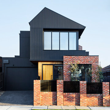
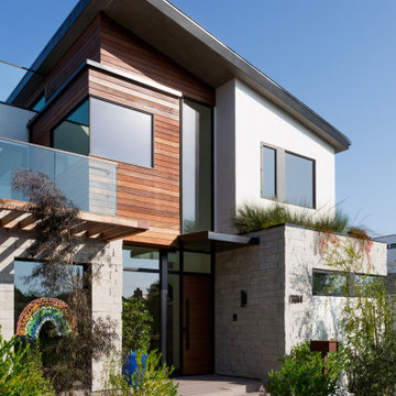
The front facade is composed of bricks, shiplap timber cladding and James Hardie Scyon Axon cladding, painted in Dulux Blackwood Bay.
Photography: Tess Kelly
Esempio della villa bianca contemporanea a due piani di medie dimensioni con tetto piano
Facciate di case contemporanee di medie dimensioni
1