78.768 Foto di ingressi e corridoi con pareti bianche e pareti multicolore
Filtra anche per:
Budget
Ordina per:Popolari oggi
1 - 20 di 78.768 foto
1 di 3
The Villa Mostaccini, situated on the hills of
Bordighera, is one of the most beautiful and
important villas in Liguria.
Built in 1932 in the characteristic stile of
the late Italian renaissance, it has been
meticulously restored to the highest
standards of design, while maintaining the
original details that distinguish it.
Capoferri substituted all wood windows as
well as their sills and reveals, maintaining the
aspect of traditional windows and blending
perfectly with the historic aesthetics of the villa.
Where possible, certain elements, like for
instance the internal wooden shutters and
the brass handles, have been restored and
refitted rather than substituted.
For the elegant living room with its stunning
view of the sea, Architect Maiga opted for
a large two-leaved pivot window from true
bronze that offers the guests of the villa an
unforgettable experience.
Tom Crane Photography
Ispirazione per un ingresso o corridoio classico con pareti bianche e parquet scuro
Ispirazione per un ingresso o corridoio classico con pareti bianche e parquet scuro
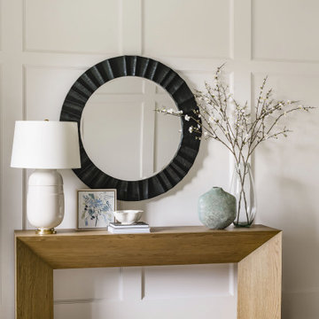
Detail shot of the completed styling of a foyer console table complete with black mirror, white table lamp, vases, books, table artwork and bowl in addition to the custom white paneling, chandelier, rug and medium wood floors in Charlotte, NC.
Download our free ebook, Creating the Ideal Kitchen. DOWNLOAD NOW
For many, extra time at home during COVID left them wanting more from their homes. Whether you realized the shortcomings of your space or simply wanted to combat boredom, a well-designed and functional home was no longer a want, it became a need. Tina found herself wanting more from her Old Irving Park home and reached out to The Kitchen Studio about adding function to her kitchen to make the most of the available real estate.
At the end of the day, there is nothing better than returning home to a bright and happy space you love. And this kitchen wasn’t that for Tina. Dark and dated, with a palette from the past and features that didn’t make the most of the available square footage, this remodel required vision and a fresh approach to the space. Lead designer, Stephanie Cole’s main design goal was better flow, while adding greater functionality with organized storage, accessible open shelving, and an overall sense of cohesion with the adjoining family room.
The original kitchen featured a large pizza oven, which was rarely used, yet its footprint limited storage space. The nearby pantry had become a catch-all, lacking the organization needed in the home. The initial plan was to keep the pizza oven, but eventually Tina realized she preferred the design possibilities that came from removing this cumbersome feature, with the goal of adding function throughout the upgraded and elevated space. Eliminating the pantry added square footage and length to the kitchen for greater function and more storage. This redesigned space reflects how she lives and uses her home, as well as her love for entertaining.
The kitchen features a classic, clean, and timeless palette. White cabinetry, with brass and bronze finishes, contrasts with rich wood flooring, and lets the large, deep blue island in Woodland’s custom color Harbor – a neutral, yet statement color – draw your eye.
The kitchen was the main priority. In addition to updating and elevating this space, Tina wanted to maximize what her home had to offer. From moving the location of the patio door and eliminating a window to removing an existing closet in the mudroom and the cluttered pantry, the kitchen footprint grew. Once the floorplan was set, it was time to bring cohesion to her home, creating connection between the kitchen and surrounding spaces.
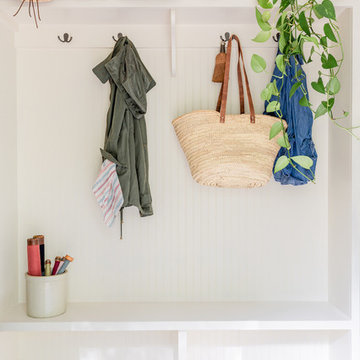
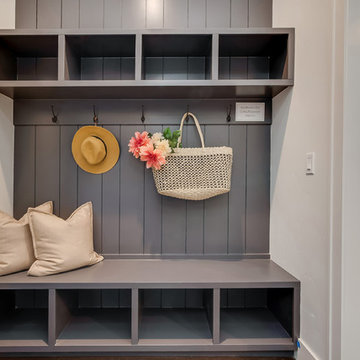
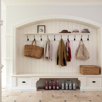
The color palette carries into the mudroom, where we added beautiful new cabinetry, practical bench seating, and accessible hooks, perfect for guests and everyday living. The nearby bar continues the aesthetic, with stunning Carrara marble subway tile, hints of brass and bronze, and a design that further captures the vibe of the kitchen.
Every home has its unique design challenges. But with a fresh perspective and a bit of creativity, there is always a way to give the client exactly what they want [and need]. In this particular kitchen, the existing soffits and high slanted ceilings added a layer of complexity to the lighting layout and upper perimeter cabinets.
While a space needs to look good, it also needs to function well. This meant making the most of the height of the room and accounting for the varied ceiling features, while also giving Tina everything she wanted and more. Pendants and task lighting paired with an abundance of natural light amplify the bright aesthetic. The cabinetry layout and design compliments the soffits with subtle profile details that bring everything together. The tile selections add visual interest, drawing the eye to the focal area above the range. Glass-doored cabinets further customize the space and give the illusion of even more height within the room.
While her family may be grown and out of the house, Tina was focused on adding function without sacrificing a stunning aesthetic and dreamy finishes that make the kitchen the gathering place of any home. It was time to love her kitchen again, and if you’re wondering what she loves most, it’s the niche with glass door cabinetry and open shelving for display paired with the marble mosaic backsplash over the range and complimenting hood. Each of these features is a stunning point of interest within the kitchen – both brag-worthy additions to a perimeter layout that previously felt limited and lacking.
Whether your remodel is the result of special needs in your home or simply the excitement of focusing your energy on creating a fun new aesthetic, we are here for it. We love a good challenge because there is always a way to make a space better – adding function and beauty simultaneously.
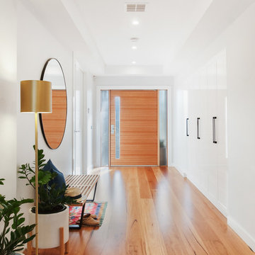
Ispirazione per un ingresso o corridoio contemporaneo con pareti bianche e pavimento in legno massello medio
Photography: Jen Burner Photography
Idee per un ingresso con anticamera chic di medie dimensioni con pareti bianche e pavimento in mattoni
Idee per un ingresso con anticamera chic di medie dimensioni con pareti bianche e pavimento in mattoni
Esempio di un ingresso con anticamera minimalista con pareti bianche, pavimento in gres porcellanato e pavimento grigio
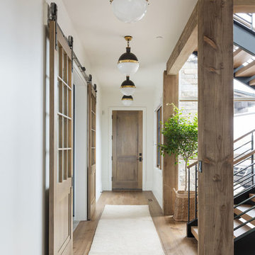
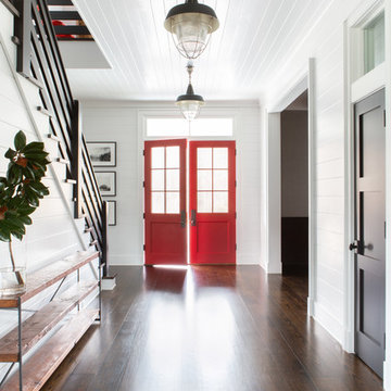
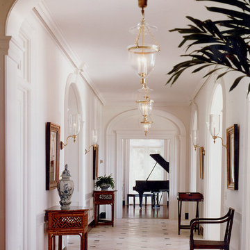
Ispirazione per un grande ingresso o corridoio classico con pareti bianche, pavimento in legno massello medio e pavimento marrone
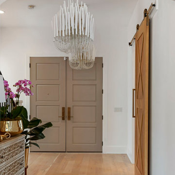
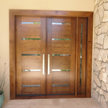
Idee per una porta d'ingresso di medie dimensioni con pareti bianche, parquet chiaro, una porta a due ante e una porta marrone
Esempio di un ingresso con anticamera chic di medie dimensioni con pareti bianche, pavimento in legno massello medio e pavimento marrone
Mosaic Media Melbourne
Immagine di un ingresso minimal con pareti bianche, pavimento in legno massello medio, una porta singola, una porta in legno bruno e pavimento marrone
Immagine di un ingresso minimal con pareti bianche, pavimento in legno massello medio, una porta singola, una porta in legno bruno e pavimento marrone
Architectural advisement, Interior Design, Custom Furniture Design & Art Curation by Chango & Co.
Architecture by Crisp Architects
Construction by Structure Works Inc.
Photography by Sarah Elliott
See the feature in Domino Magazine
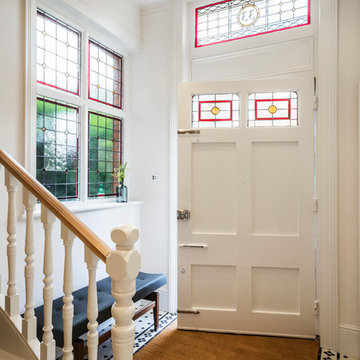
Although the existing entrance hallway was a good size it lacked character. To address this the stained glass in the fan light window above the front door and side window was reinstated, in a bespoke design, bringing light, colour and texture into the hallway.
The original tiled floor had long been removed so a period style crisp black and white tile with a border pattern was specified. This immediately visually increased the size and lightness of the hall area.
Nigel Tyas were commissioned to produce a dramatic copper and glass pendant light in the stairwell that hung from the top floor ceiling down to the ground floor, giving a visual connection and really creating a wow factor.
Jessica Delaney Photography
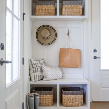
Esempio di un ingresso con anticamera stile marinaro con pareti bianche, una porta singola, una porta in vetro e pavimento grigio
Esempio di un ingresso con anticamera stile marinaro con pareti bianche, una porta singola, una porta in vetro e pavimento grigio
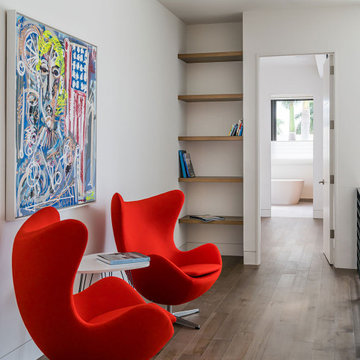
Esempio di un ingresso o corridoio design con pareti bianche e pavimento in legno massello medio
Ispirazione per un ingresso tradizionale con pareti bianche, parquet scuro e pavimento marrone
Jessie Preza
Ispirazione per un ingresso con anticamera costiero con pareti bianche, pavimento in legno massello medio e una porta in vetro
Ispirazione per un ingresso con anticamera costiero con pareti bianche, pavimento in legno massello medio e una porta in vetro
Esempio di una porta d'ingresso design di medie dimensioni con pareti bianche, una porta a due ante e una porta in legno bruno
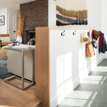
Idee per un grande ingresso o corridoio chic con pareti bianche, pavimento in marmo e pavimento beige
78.768 Foto di ingressi e corridoi con pareti bianche e pareti multicolore
1