Pantone Has Spoken: Rosy and Serene Are In for 2016
For the first time, the company chooses two hues as co-colors of the year

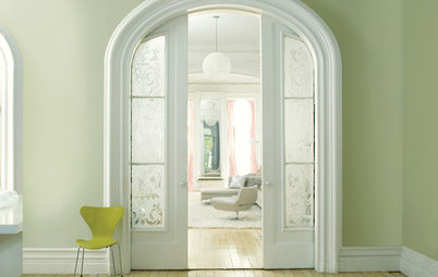
Rose Quartz has been described as a “nude pink,” meaning it’s less of a stereotypical “little girl pink” and more of a pale, toned-down blush of color. This softness gives it more flexibility in a home’s interior.
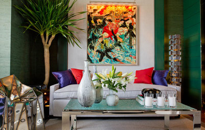
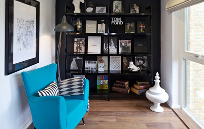
One way to add elegance and drama when working with a base of pastels is to bring in a deep, dark hue such as regal purple or a navy blue.
Or go for a modern vibe by bringing in shades of gray and cool whites. I like the contrast here between the clean lines and neutral hues with the fussier pinks.
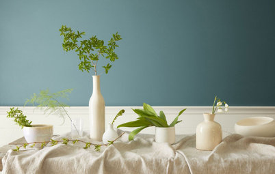
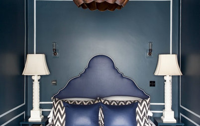
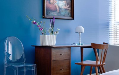
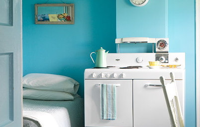
Serenity reminds me somewhat of a periwinkle blue — a soft blue with a hint of lavender. It lives up to its name as it imparts a soothing, serene feeling. I can see this hue working well in a bedroom or bathroom — spaces in which we want a calming ambience.
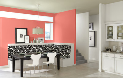
If you are digging this color combo but are leery about splashing it all over your walls or buying expensive furniture clad in either of the hues, think about bringing the colors into your home via artwork or decorative accessories. Try layering light and dark shades of the colors to make it more visually interesting.
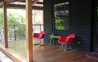
Of course you can always take these colors outside. When I showed this color combination to a friend she mentioned that it would make for a nice exterior palette for a home’s landscaping and accent colors.
Personally, I prefer pastel hues in small doses, such as on the front door and paired with a more neutral color for the siding. This Serenity-esque door color is an unusual choice that looks fresh but also elegant.
Tell us: Love ‘em or hate ’em? What do you think of Pantone’s picks for color(s) of the year?
More: Color of the Year: Off-White Is On Trend for 2016
See more colors of years past
Tell us: Love ‘em or hate ’em? What do you think of Pantone’s picks for color(s) of the year?
More: Color of the Year: Off-White Is On Trend for 2016
See more colors of years past


Sponsorizzato
Ricarica la pagina per non vedere più questo specifico annuncio
But the soft purplish-blue (Serenity) and nude-pink hues (Rose Quartz) represent a blending and blurring of gender lines, says Leatrice Eiseman, executive director of the Pantone Color Institute. “In many parts of the world we are experiencing a gender blur as it relates to fashion, which has in turn impacted color trends throughout all other areas of design,” Eiseman says. “This more unilateral approach to color is coinciding with societal movements toward gender equality and fluidity, the consumer’s increased comfort with using color as a form of expression, a generation that has less concern about being typecast or judged and an open exchange of digital information that has opened our eyes to different approaches to color usage.”