Kitchen of the Week: Light and Airy With a Bright Backsplash
A designer helps a couple update the kitchen with an efficient layout and custom details like a walnut-topped peninsula

Bryan and Heather Kurey looked at their dysfunctional kitchen and considered moving into a new home. The aging oak cabinets, oversize breakfast area and lack of countertops didn’t create a welcoming space for a couple who love to cook. But they soon realized that most of the homes they considered buying also had kitchens that needed updating. The couple looked at photos on Houzz and other sources and became inspired to remodel what they had.
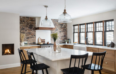
They hired designer Lisa Quina, who had helped them renovate other areas of the late-1930s home in Arlington, Virginia. Quina relocated appliances, added windows, enlarged an opening to the family room, improved storage and used local artisans for custom details that add character. Now the family enjoys a brighter kitchen that combines classic, industrial and modern design elements to better reflect its style and love of cooking.
They hired designer Lisa Quina, who had helped them renovate other areas of the late-1930s home in Arlington, Virginia. Quina relocated appliances, added windows, enlarged an opening to the family room, improved storage and used local artisans for custom details that add character. Now the family enjoys a brighter kitchen that combines classic, industrial and modern design elements to better reflect its style and love of cooking.
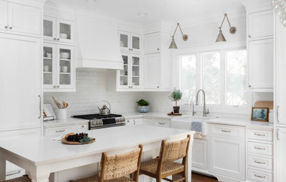
After: This shot was taken from about the same angle as the previous photo. The refrigerator and tall cabinets occupy the place that once contained the sink and dishwasher.
Quina expanded the size of the opening to the family room on the right for better flow between spaces, and she relocated the sink and range to the same wall on the left, where a door to the backyard once stood.
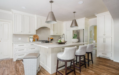
Off-white walls with beige undertones (Alabaster by Sherwin-Williams), crisp white trim (Extra White by Sherwin-Williams) and pure white Shaker-style cabinets (Simply White by Benjamin Moore) create a bright and open feel. A new walnut peninsula and walnut floating shelves provide a dose of warmth. “Because we were going away from oak cabinets, we never considered going with a wood finish for the cabinetry,” Quina says. “But the clients also didn’t want the kitchen to be all white, so that’s why we brought in wood accents.”
Dark gray 12-by-24-inch porcelain floor tiles replaced the former blue-brown tile. “I think what we like most is the color contrast it provides with the white on the cabinets and walls,” Bryan says.
The open doorway to the left of the fridge leads to the dining room.
Floor: Anthracite 12 by 24 inches, Lugarno Ceramics
Find a kitchen designer near you
Quina expanded the size of the opening to the family room on the right for better flow between spaces, and she relocated the sink and range to the same wall on the left, where a door to the backyard once stood.
Off-white walls with beige undertones (Alabaster by Sherwin-Williams), crisp white trim (Extra White by Sherwin-Williams) and pure white Shaker-style cabinets (Simply White by Benjamin Moore) create a bright and open feel. A new walnut peninsula and walnut floating shelves provide a dose of warmth. “Because we were going away from oak cabinets, we never considered going with a wood finish for the cabinetry,” Quina says. “But the clients also didn’t want the kitchen to be all white, so that’s why we brought in wood accents.”
Dark gray 12-by-24-inch porcelain floor tiles replaced the former blue-brown tile. “I think what we like most is the color contrast it provides with the white on the cabinets and walls,” Bryan says.
The open doorway to the left of the fridge leads to the dining room.
Floor: Anthracite 12 by 24 inches, Lugarno Ceramics
Find a kitchen designer near you
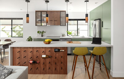
Quina added the ceiling beam to the left of the range to mirror the existing beam on the right. “We considered getting rid of the existing beam entirely but instead decided to add the one on the left to frame where the range was going to land so it would look like it had always been there,” she says.
Quina also added the window to the right of the range to match the existing window of the same size to the left. “The range needed to be centered to create symmetry, and we didn’t want to condense all the appliances there,” Quina says.
A new layered lighting plan includes ceiling lights, two custom pendants and black sconces with walnut bases on each side of the range. “They had no task lighting in the original kitchen and no ambient light,” Quina says.
A 24-inch flat panel stainless microwave drawer sits under the countertop and close to the refrigerator to help keep the work surface free from clutter. The upper cabinet above holds cups and wine glasses. “We thought about going with no upper cabinets at all, but I’m glad we did them now,” Bryan says,
Flat-panel microwave drawer, 24 inches, in stainless steel: Sharp
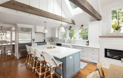
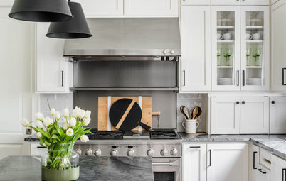
Glossy, crackled blue-green scallop tiles create a statement backsplash behind the BlueStar range. “With the linear nature of this house, we needed tiles with movement,” Quina says. The custom range hood is black steel, which complements the matte black cabinet hardware.
The long non-operable window features a deep metal sill. “This window was a way to add light in a modern and fresh way,” Quina says. “It creates a wonderful focal point.” (Since this photo was taken, Bryan and Heather added a red maple tree outside the window for privacy.)
The custom walnut floating shelves were made from wood salvaged from a local boat. Durable gray quartz countertops add contrast to the cabinets and complement the dark gray porcelain floor tiles. “We do a lot of batch cooking on the weekends, so having that long countertop makes things much easier,” Bryan says.
Cabinet hardware: Channing square knob and Channing pull, Top Knobs; backsplash tiles: Ogee Drop in Glacier Bay, Fireclay Tile; custom range hood: Mike Hart of Arking Welding; custom walnut floating shelves: Ryback Woodworking
Before: This photo shows the old breakfast nook with a built-in bench, a standalone table and a large window that overlooked the backyard. “We were worried about losing that window,” Bryan says.
After: Quina removed the old breakfast nook and replaced the window with a new glass door that opens to the backyard. This move addressed the couple’s concern about losing the natural light from the eliminated window, and it allowed Quina to extend the countertop and run of cabinets into the former breakfast nook to create a more spacious sink area.
Quina gave the sink area a modern industrial look with a stainless undermount single-bowl farmhouse sink, a single-handle pull-down faucet with clean lines and an instant hot water dispenser that the family loves. “In the phase-one part of this home renovation, we added modern industrial elements, so we didn’t want a white farmhouse sink,” Quina says. “We wanted to go a bit more industrial. We were very intentional throughout the house introducing the industrial and metal elements.”
Sink: Strive, Kohler
Sink: Strive, Kohler
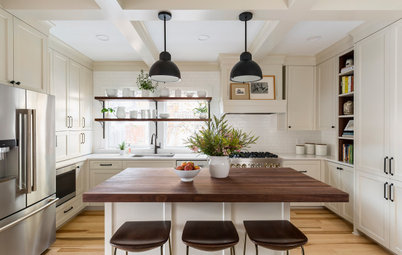
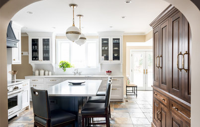
The built-in walnut-topped peninsula attaches to the wall and partially rests on a storage cabinet. Custom black steel legs complement the black steel range hood and align with other industrial elements.
Contemporary black wire counter stools have teal cushions for a punch of color that complements the backsplash tile. “Like most families, we spend the majority of our time in the kitchen, so it was important to still have some form of seating in there,” Bryan says. “Having that peninsula is where we do all our Zoom calls for meetings for work and visiting with friends.”
The tall cabinets seen to the left of the peninsula give the family improved pantry storage.
Custom tabletop: Rybak Woodworking; custom table legs: Arking Welding and Fabrication
Before: These floor plans of the former kitchen show the dysfunctional layout, with the sink and dishwasher (top left) placed far away from the range (bottom center) and refrigerator (center right). The breakfast nook (bottom right) took up valuable square feet.
After: Quina eliminated the breakfast nook and created a sink area (bottom right) and new door to the backyard. The sink and range are now on one wall with a generous run of countertop space. The fridge replaced the former sink area (top left). The peninsula is in the center.
“When we have people over now, it’s easier for gathering since it’s more open,” Bryan says. “There’s way more light, and that leads us to spending more time there.”
More on Houzz
Read more kitchen stories
Browse kitchen photos
Hire a kitchen remodeler
Shop for kitchen products
“When we have people over now, it’s easier for gathering since it’s more open,” Bryan says. “There’s way more light, and that leads us to spending more time there.”
More on Houzz
Read more kitchen stories
Browse kitchen photos
Hire a kitchen remodeler
Shop for kitchen products

Sponsorizzato
Ricarica la pagina per non vedere più questo specifico annuncio
Kitchen at a Glance
Who lives here: Bryan and Heather Kurey and their teenage daughter
Location: Arlington, Virginia
Size: 215 square feet (20 square meters)
Designer: Lisa Quina of Barefoot Dwelling
Before: This view of the former kitchen shows the tight layout, basic oak cabinets and limited countertops, as evident next to the sink shown here. Previous homeowners installed the blue-brown tile, resulting in an uneven floor. A freestanding wood table provided some extra work surface and storage.
There was also an oversize breakfast area (see “before” floor plans below) that took up valuable floor and wall space that could be better used for storage and expanding the layout of appliances. The door seen in this photo leads down to the basement.