7 Stylish New Kitchens in White, Wood and Black
See how designers mix classic materials to create warm and inviting spaces with a touch of drama

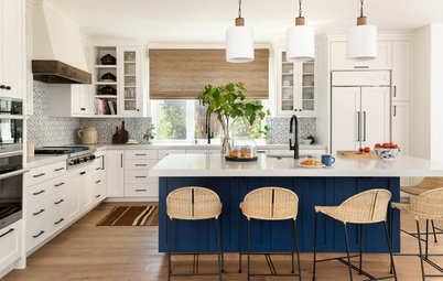
We recently profiled stylish kitchens that feature palettes of white and wood, as well as white, wood and blue. This week, we look at kitchens with white, wood and black elements. This combination is both warm and dramatic, relaxed yet sophisticated. The high-contrast look delivers a style punch, while the introduction of wood tampers what could veer too stark. It’s worth keeping in mind that not all black paints are the same, and many exhibit blue or green undertones in certain lighting and on computer screens. But without further ado, here are seven beautiful kitchens in white, wood and black.
2. Simplified and Stylish
Designers: Carrie Hupp and Chelsea Duran of Cdot Design Studio
Location: Scottsdale, Arizona
Size: 510 square feet, including a nearby dining area (47 square meters)
Homeowners’ request. “When the client purchased the house, it was over-the-top traditional Spanish style from top to bottom, inside and out,” designer Carrie Hupp says. “The client loved the architectural style of the house but wanted it to become a simplified modern Spanish oasis. So we stripped it down, smoothed it out and started adding in the appropriate layers of materials and textures.”
White, wood and black details. The perimeter cabinets are painted Black Bean by Dunn-Edwards. The island is walnut with a custom greige stain. The top is an end-grain walnut butcher block. “The existing terra-cotta floor tile was beautiful, so that remained and really set the tone of the house,” Hupp says. “It was clear to me that the kitchen cabinets needed to be a shade of black to contrast the crisp white walls that were just smoothed. I did not want a true black, as that would be too harsh for this tranquil space, so we went with a softer version of a black. It gives off just the right amount of warmth and works really well with the flooring.”
Other special features. Large arched range hood detail. Hand-painted terra-cotta tile backsplash. Arabescato honed marble perimeter countertops. Spindle leg detail and open shelving on the island. “This helped break up all the cabinetry on that side of the room and gave a thoughtful space to display the homeowners’ beautiful wares and cookbooks,” Hupp says. “It’s all about balance and using details and nods to the Spanish style but in a clean, modern way.”
Backsplash tile: Rue Des Rosiers 5 in charcoal and off-white, Tabarka Studio; hood surround fabrication: Swartz Construction
Shop for wall and floor tile
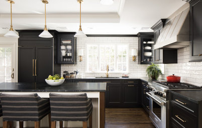
3. Clean and Compact
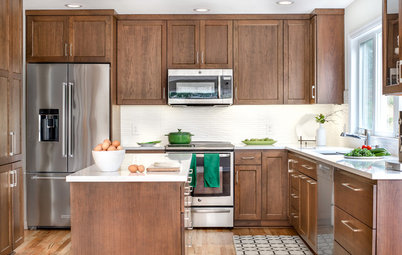
Designer: Melissa Cohen of Context
Location: Woodstock, New York
Size: 200 square feet (19 square meters)
Homeowners’ request. “The homeowner wanted to make the kitchen feel bigger, brighter and connected to the dining area, which was a former porch with windows on all three sides, but the structure was not in good shape,” designer Melissa Cohen says. “We also added a large island that on one end is part of the kitchen triangle, another end is for kids or guests to sit at while food is prepared, and the side nearest to the dining area houses a wine fridge.”
White, wood and black details. The upper cabinets are teak. The backsplash is white porcelain tile in a chevron pattern. The walls are painted Pure White by Sherwin-Williams. The lowers are black laminate. “As the house has midcentury modern lines, I felt that bringing in teak wood would provide a good reference to that era,” Cohen says. “The homeowners had other teak pieces throughout the house, so that felt like a natural fit.
“To make the kitchen more contemporary, we used Fenix laminate for all the lower cabinets. This is a great material. It’s not your grandmother’s Formica counters. And because the ceiling is still a bit shy of a regular-height ceiling, making the lower cabinets black was important in the way wearing black trousers makes your legs look longer.”
Designer tip. “To provide height to a room, make the lower cabinets darker than the upper cabinets,” Cohen says.
Island light fixture: Solis drum pendant in white, Pablo Designs

Hai bisogno di un professionista per il tuo progetto di ristrutturazione della casa?
Troviamo i professionisti più adatti a te
Troviamo i professionisti più adatti a te
4. Crisp and Contemporary
Designer: Traci Connell Interiors
Builder: MHM Living
Location: Dallas
Homeowner’s request. “The homeowner desired a much more updated look in their kitchen to coordinate with the rest of their remodeled home,” designer Traci Connell says. “She is a busy single mom and businesswoman who is always on the go and needed a functional space where she could easily whip up a meal and enjoy the time with her kids.”
White, wood and black details. The cabinets are white, black and wood-look laminate. The rear wall is painted Peppercorn by Sherwin-Williams. “She loved the idea of having a sleek look with laminate cabinets instead of wood to prevent scratching and wear and tear,” Connell says. “This gave a much more modern feel to the space and the durability is unrivaled. We chose the neutral color palette because it connects perfectly to the rest of her home and allows her artwork and family heirlooms to be the pops of color.”
Other special features. The countertops and backsplash are Infinity White quartzite. “We chose a quartzite instead of a quartz in order to capitalize on the natural movement in the material and give way to a more organic feel,” Connell says.
Designer tip. “Our favorite trick in this project was going hardware-less and using push-front cabinetry,” Connell says. “Without having pulls on the drawers and doors, we were able to achieve a super clean and modern look.”
Light fixture over window: Galleria wall sconce, Kuzco Lighting
Before and After: 3 Bold Black-and-White Kitchen Makeovers
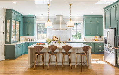
5. Bold and Balanced
Designer: Marissa Houston of CKF
Location: Bellevue, Nebraska
Size: 170 square feet (16 square meters)
Homeowners’ request. Create a timeless kitchen with clean lines, neutral colors and improved functionality, including deep drawers, pullouts with built-in utensil canisters and a pantry cupboard with rollout shelves.
White, wood and black details. The upper cabinets are paint-grade maple in Decorator’s White by Benjamin Moore. The lower cabinets and refrigerator wall cabinets are in an ebony finish. The island base, range hood and cubbies are walnut. “We wanted the kitchen to have a timeless look with black and white cabinetry, but we also wanted to bring in some warmth, so we incorporated those walnut accents,” designer Marissa Houston says.
Other special features. Quartz countertops (White Cliff by Cambria) and quartz slab backsplash (Ethereal Haze by Silestone). Matte black hardware.
Designer tip. “If you can, go with a full-height quartz backsplash,” Houston says. “It elevates the space for a clean yet dramatic wow factor. Then down the road you don’t have to worry about grout line repairs like you would with tile. This material is not seamless but manufactured with fewer seams than tile.”
New to home remodeling? Learn the basics
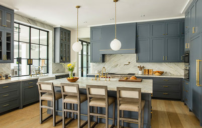
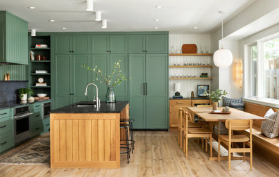
6. Warm and Welcoming
Designer: Carrie Goldman of Apex Homes
Location: Denver
Size: 187 square feet (17 square meters); 11 by 17 feet
Homeowners’ request. “The entire vision for this home, including the kitchen, was a midcentury modern feel that seamlessly incorporated modern finishes that were cohesive with vintage mid-mod furniture and accents that the client had inherited,” says designer Carrie Goldman, who collaborated with her client through Houzz ideabooks. “The homeowners wanted something on-trend yet also timeless. The lower Shaker cabinet doors are a nod to the traditional, while the flat-panel drawers and upper wood cabinets, open shelving, wrapped hood and paneled refrigerator are intended to modernize and elevate the space.”
White, wood and black details. The lower cabinets are a saturated black with a blue undertone (Soot by Benjamin Moore). The upper cabinets, range hood and floating shelves are hickory in a butter pecan stain. The flooring is white oak. The walls are finished in white venetian plaster. “The graphite stainless range and Soot lower cabinets are modern in color palette and style but also mute the lower half of the kitchen, allowing the eye to be drawn up with the white walls and light hickory cabinets,” Goldman says. “This gives the illusion of a higher ceiling and a larger space.”
Other special features. Marble-look quartz countertops.
Designer tip. “One way to have fun with natural wood is to change the grain flow to create a unique visual effect,” Goldman says. “Also, with cabinets, for a timeless transitional look, mix Shaker cabinets and flat-panel cabinet doors and drawer fronts. If you are leaning more modern versus transitional, try a flat-panel door; if you want to go more traditional, use more Shaker.”
Pendant lights: Sloan one-light large pendant in aged brass, Mitzi by Hudson Valley; range: slide-in in Graphite Black, 48 inches, Dacor; cabinet designer: Tallgrass Kitchen and Bath
7. Lofty and Luxe
Designer: Heidi Helgeson of H2D Architecture + Design
Location: Shoreline, Washington
Size: 400 square feet (37 square meters); 20 by 20 feet
Homeowners’ request. “We relocated the kitchen to this area, which used to be the existing living room,” designer Heidi Helgeson says. “The flow of the house did not work well, so the kitchen was moved to this location for better flow of the other spaces in the home.”
White, wood and black details. Black ceiling beams, window frames and flat-panel upper cabinets. Wood flat-panel cabinets and flooring. White walls. “The kitchen is flooded with light due to the large windows and west-facing window wall, so the mix of materials helps to maintain variety in the space as the room fills with light at different times of the day,” Helgeson says. “In addition, the material selections were aimed at creating a modern yet warm, welcoming space.”
Designer tip. “Consider two-sided seating at the island to allow for flexibility of seating options, as well as to promote conversation with more than one person sitting at the island,” Helgeson says.
“Uh-oh” moment. “There is an existing fireplace that separates this space from the living room (on the left),” Helgeson says. “We originally hoped to remove this fireplace to open the kitchen to the other spaces. Instead, the fireplace had to remain due to structural constraints. We used this opportunity to create a pantry cabinet with built-in appliance garage.”
More on Houzz
Read more kitchen design stories
See more kitchen photos
Shop for kitchen storage and organization
Find a kitchen remodeling pro

Sponsorizzato
Ricarica la pagina per non vedere più questo specifico annuncio
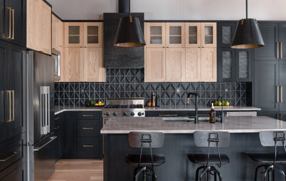
Designer: Ashley Kuhni of Ashtin Homes
Builder: Ashtin Homes
Location: Queen Creek, Arizona
Size: 352 square feet (33 square meters); 16 by 22 feet
Homeowners’ request. “This beautiful space was created with the purpose of entertaining large groups of family and friends,” designer Ashley Kuhni says. “As you can see, there are large glass cabinets to either side of the kitchen hood that are filled with usable platters, servingware and dishes. Using as many glass cabinets as we did in this kitchen was risky. Going into the design, we knew it could overwhelm the space if not done the right way. We also knew we would have to take special care in arranging the objects on the shelves.”
White, wood and black details. The island and glass cabinets are painted Midnight Black by Benjamin Moore. The rest of the cabinets are rift-sawn oak. The range hood and interior of the glass cabinets are white. The walls and ceiling are Chantilly Lace by Benjamin Moore. The flooring is light oak. “Our homeowners wanted to have a space that had deep colors while still keeping it bright and airy,” Kuhni says. “So we put color into our kitchen with the black and rifted oak cabinets and softened the space with the use of white cabinet interiors and a white hood.”
Other special features. Mont Blanc quartzite countertops and backsplash. “With the hood being painted white and kept simple in its design, we really felt it was important to add more texture into this space,” Kuhni says. “This was achieved through the use of beautiful flat crown molding work and a shiplap ceiling to finish everything off.”
Designer tip. “Trust your design instincts, watch the details carefully, especially when it comes to sizing, and don’t be afraid to do what’s sometimes not the normal,” Kuhni says.
Find a kitchen designer near you