
Guest House
Photo credit Jane Beiles
Located on a beautiful property with a legacy of architectural and landscape innovation, this guest house was originally designed by the offices of Eliot Noyes and Alan Goldberg. Due to its age and expanded use as an in-law dwelling for extended stays, the 1200 sf structure required a renovation and small addition. While one objective was to make the structure function independently of the main house with its own access road, garage, and entrance, another objective was to knit the guest house into the architectural fabric of the property. New window openings deliberately frame landscape and architectural elements on the site, while exterior finishes borrow from that of the main house (cedar, zinc, field stone) bringing unity to the family compound. Inside, the use of lighter materials gives the simple, efficient spaces airiness.
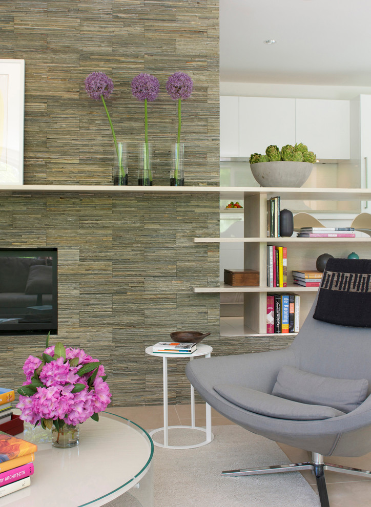
A challenge was to find an interior design vocabulary which is both simple and clean, but not cold or uninteresting. A combination of rough slate, white washed oak, and high gloss lacquer cabinets provide interest and texture, but with their minimal detailing create a sense of calm.
Located on a beautiful property with a legacy of architectural and landscape innovation, this guest house was originally designed by the offices of Eliot Noyes and Alan Goldberg. Due to its age and expanded use as an in-law dwelling for extended stays, the 1200 sf structure required a renovation and small addition. While one objective was to make the structure function independently of the main house with its own access road, garage, and entrance, another objective was to knit the guest house into the architectural fabric of the property. New window openings deliberately frame landscape and architectural elements on the site, while exterior finishes borrow from that of the main house (cedar, zinc, field stone) bringing unity to the family compound. Inside, the use of lighter materials gives the simple, efficient spaces airiness.
A challenge was to find an interior design vocabulary which is both simple and clean, but not cold or uninteresting. A combination of rough slate, white washed oak, and high gloss lacquer cabinets provide interest and texture, but with their minimal detailing create a sense of calm.
double sided bookcase room divider