Help Gaining Confidence Painting Ombré
Tips? Tricks? Techniques? I've watched you tube videos But don't feel confident enough yet.
I'm torn between gradiating horizontally or vertically, or simulate something like a sunst.
The reason is to camouflage a wall in the kitchen dining area. It seems prior wallpaper glue had not been washed but was painted over.
There will be a (white) bookshelf to the right.
Thanks for any advice.
Commenti (85)

hollybar
5 anni faYou can prime and paint or paper over glazed walls. If I were to tackle this,I'd have rollers,brushes, and sponges at hand. And water. I do understand the allure of doing this, I have done similar years ago, just understand that it evolves. As an old artist I know says,"Use your BIG eyes". She means 'step back and look,really look, at what is going on' and course correct as needed.

lynartist
5 anni faI have used many different glazed over the years. Made our own oil glazed way back before commercial ones could be bought. The oil glazed were the most beautiful but for lots of reasons aren’t used much anymore. You can use the Golden but it’s an art product so will be expensive. MM has one as well as BM and some othe paint suppliers. I like Auquacreme from faux effects. You would have to send off for it though. They don’t usually sell to the general public.


lynartist
5 anni faAnd not to misunderstand MS colors, I have used Golded acrylics often! There are many times when I have mixed Golden interference colors with my glazed as a topcoat for a wall or ceiling treatment;)!- PRO
User
5 anni faWe miss the oil glaze too. Golden slow drying acrylics fluid acrylics are not very expensive and are made to be mixed in this glaze. Golden acrylics at the art store is a different product.
tdemonti
Autore originale5 anni faSo, as I'm painting, all your advice was swarming through my head, including fix the wall first. I wish I had done things differently. Thus, I live and learn.
I was overzealous with the Floetrol. The colors are too dark for the floor. And I'm unsure how I like the vertical with the horizontal of the countertop while facing this wall.
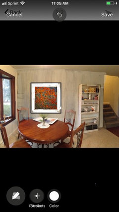
My husband actually likes it and says live with it for a year. I agreed to live with it for a week. We know the wall imperfections are there but are non-existent from a short distance.The beauty is that this is all wall - no windows or cabinets to work around. We've already discussed re-sheetrocking. Maybe it'll grow on me.

This is a pano of the area.
Feedback, please.lynartist
5 anni faI give you credit for this huge effort! Sigh... all the problems I said could happen unfortunately did happen here. You have lots of areas were you didn’t keep a wet edge and they are very obvious. This isn’t the soft and seamless transition of color you were looking for. I’m guessing you didn’t have help with this either. If I were you I would probably keep practicing or just get wallpaper. Paint treatments really aren’t as easy as they appear on you- tube!


tdemonti
Autore originale5 anni faUltima modifica: 5 anni falynartistyou are correct that I did not have help. Hubby wants nothing to do with painting. I was more interested in the cloudy effect than smooth transition. It would've taken a few glasses of wine and several weeks to relay an idea and convince a friend to help.
I should've stopped immediately and washed off the wall but I was committed. I didn't like what I got from a brush and switched to a pad. I also should have stuck with plain water to keep things moist - and enable easy repaint.
My tail is between my legs, though. Those in the know do know. And those who don't seem to love it.
Adding the image of the statue could be the ticket.


lisaam
5 anni faYou achieved a really interesting effect. I'd describe is as almost moire -like vs ombre but it's pretty.

tartanmeup
5 anni faIt's not perfect but it was a first effort. I've seen worse looking walls. Kudos to you for trying out your idea rather than just wondering about it!
cat_ky
5 anni faI agree, it doesnt look the best, however, I give you an A for trying it. Now, please get an electric sander, and sand that wall down until you get rid of all the left over paste and have a completely smooth wall, or, have someone that is very good at sheetrocking come in and skim coat the entire wall, and then just prime and repaint it. I use a mouse sander for stuff like this. It is easy to handle for females with smaller hands. Yes, it makes some dust, so throw plastic over stuff, and let it all settle, before you remove the plastic, if you go the sanding route. It will take a bit more sanding now, with all the layers of paint, but, you sound like you are ready to put in a bit of effort.

ilikefriday
5 anni faUltima modifica: 5 anni faI think you did an excellent job and that it looks fab in terms of how well you copied your inspiration. The reason it might seem a little off could be because it goes back and forth between dark and light, just as your inspiration photo does. Most ombre goes from dark to light and does not skip around in between. I think you could definately decorate around that wall however if you are unhappy with it, you have created a fantastic backdrop for either a mural or a all-over stencil.
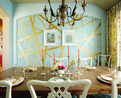
Here are some rooms with a similar design on the wall.
If it were my wall, I would keep it.


Jennifer Hogan
5 anni fa"We've already discussed re-sheetrocking." - Why? You don't need to re-sheet rock. All you need to do is sand the areas where the paste was not properly removed and smooth on some mud, feathering the edges and sand again. A couple of hours max and you are ready to prime and paint.
lynartist
5 anni faIf you keep this I would encourage you to make a glaze with white paint water and glazing compound such as the golden or MM! You can add a bit of blue to it but just a tiny bit! Start at the top by doing a good clean cut in! Work your way down the wall . Apply the glaze with a brush and spread it with the brush that I suggested! Keep a wet edge. Do not use Floetrol. One third paint, one thins water, one third glaze! This will soften the whole effect.lynartist
5 anni faAdding a soft gray/ blue glaze ( white paint with just a dash of blue& black) , water and glazing will give you an effect similar to this. Then you can add a large canvas which will hide a lot of mistakes!

everdebz
5 anni faNice and a lot like walls I've seen here, and there.... good for you! Can the case not have same color [which?] added to the back only. Very neutral plates or such with stands, and maybe few metal plates to bring in counter's color.
everdebz
5 anni faI like your chairs, btw... and simple art could allow them and wall to be noticed more:

[https://www.houzz.com/products/blueprint-map-paris-black-framed-art-print-32x44x1-prvw-vr~125441770[(https://www.houzz.com/products/blueprint-map-paris-black-framed-art-print-32x44x1-prvw-vr~125441770)hollybar
5 anni faMixing up a bit of watery glaze would pull it together a bit more and help lose some of the harder edges. That said, not bad for a first effort. Btw, do you think the pics look the same as it does IRL?
tdemonti
Autore originale5 anni faUltima modifica: 5 anni faHollybar, the color in the pictures is off. This house has deeper eves and lighting is always a challenge. This space is on the north side. It was a cloudy weekend.
Thank you all for the boost and feedback. I would've needed a machine sander to smooth the wall and want nothing to do with dust after the kitchen remodel. The underlying flaws really do need to be pointed out. It was somewhat of an adventure. (The next project is a huge living room and dining room space.).
I may lighten this a bit as lynartist suggests. Or a 2"- 2-1/2" stenciled border at the top.. Same colors. I don't mind imperfection or hard edges but dirty is a good word that leads me to "industrial" which I dont want. The shelf will be filled with books and will stay solid white.
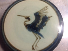
Artwork is certainly an option. My hubby takes nice photos that could be enlarged, I.e. street art from Sicily.. Thanks for that inspiration, everdebz. Or, maybe paint something like this. actually, this heron as a large decal could be perfect.
everdebz
5 anni faOkdoke… in quick way I was trying a bit to strengthen the beautiful vibe of your chairs !!

Grant Neag
5 anni faOmbre is a little tough, if you do not like how it comes out you can always buy wallpaper, this would save a lot of time and $$$. Also, consider your lighting in this room as Ombre may be affected.
tdemonti ha ringraziato Grant Neagtdemonti
Autore originale5 anni faUltima modifica: 5 anni faThe current ceiling light is temporary and will be replaced by a ceiling fan (for circulation throughout this split level). But you are right, Grant Neag. That ought to be the next step. Thank you for that.
everdeb, I pulled this from the chairs but think it's too curly-cu.
We look at photos tonight. (This is a small poster.)
everdebz
5 anni faUltima modifica: 5 anni faWow fun art piece... adds a 'time and place' feel for the chairs, as though sitting in on the performance. ;-)
Idk about the small stencil-paint.... I'd wait for your art, cause that'll matter as much.... not sure a border is absolutely necessary, unless - what about using same paint, but in a horizontal manner. Maybe a straight line to contrast with the wall... in your darkest neutral.
everdebz
5 anni faUltima modifica: 5 anni fasimilar but no border.... I'm not trying to beat on it but the simple art helps me 'see' the table more, and yes the wall too.
 Hand-painted Platinum Wall Pattern with Mica Chips · Maggiori informazioni
[https://www.houzz.com/photos/hand-painted-platinum-wall-pattern-with-mica-chips-eclectic-bedroom-phvw-vp~53159[(https://www.houzz.com/photos/hand-painted-platinum-wall-pattern-with-mica-chips-eclectic-bedroom-phvw-vp~53159)everdebz
5 anni faUltima modifica: 5 anni faI'm "brainstorming with you"... I almost thought a painted frame/feature like this could work, neutral I guess. I know, the bookcase is there... maybe after your art is hung you could ombre around it. It's not complicated or is it. I think you want to 'finish off' the wall. :)
 Dazzling Dining Room · Maggiori informazioni
https://www.houzz.com/photos/dazzling-dining-room-eclectic-dining-room-houston-phvw-vp~1676098
tdemonti ha ringraziato everdebzeverdebz
5 anni faAs it says: it makes a statement ! but if you love it, love it all.
 Dazzling Dining Room · Maggiori informazioni
lynartist
5 anni faPlease don’t do the stencil! I have been a decorative artist for 30 years. I have seen and done every kind of wall finish come and go and believe me when I tell you to not do the stencil. A successful wall finish is not as easy as it looks on a video. The problem is you are dealing with water Bourne paints( in a house with the heat on) with low humidity! It dries too fast! Getting a clean edge at the ceiling and in the corner is a dead giveaway; that and the stop and start lines. Make this better by going over it as I suggested earlier. If it doesn’t help then repaint the wall. If you decide to keep it you need to hang larger more grading art that doesn’t match the chairs! Try a black frame.lynartist
5 anni faThere is an appropriateness that goes along with certain wall treatments. Just because one likes how a certain one looks doesn’t mean that it is appropriate for their space. The furnishings, architecture, even were the area the home is located can determine the appropriate wall finish! The ultimate success of the finish is a well thought out plan.lynartist
5 anni faIf you decide to keep this I do encourage you to do the topcoat as I said before. This is still a more contemporary finish in a very traditional setting. Your furniture is more country and you have a simple white bookshelf. Try to find art that bridges the gap between all these elements. Something large enough to hide the mistakes, a bit more modern, warm color to go with the furniture, a white mat to go with the bookcase!
tdemonti
Autore originale5 anni faI am still waffling. . .
I practiced sketching the statue and heron images and cant draw, so I won't be painting an image on the wall. I looked through photos and will print some tonight to tape up.I do have black frames.
I've been toying with the idea of moving this table/chairs to the "dining room" for a while but havent found a likeable replacement yet.everdebz
5 anni faUltima modifica: 5 anni faoh, you're wondering when you'll find another! been there...
Do you think one striking piece of art 'balances' the bookcase nearby?
hummingalong2
5 anni faUltima modifica: 5 anni fa(For me) when I have to struggle to make myself like or feel happy with something, it rarely works, and it's a relief when I finally decide to move on and do something different, or simply paint over it. I think the bookcase you have on that wall isn't a good fit, it's too small.
tdemonti
Autore originale5 anni faUltima modifica: 5 anni faSmiling. You're both right. Though I think these chairs are too chunky for the space, the set is a nice visual when entering the front door.
The book shelf is for cookbooks mostly. It looks small in the panoramic photo but really does fit the space well.
Here's the latest. Below are 8-1/2" X 11" off the printer. The space between the bookshelf and outside wall is 8' wide. I have 16" x 24" frames.
Is the frame size too big?


tdemonti
Autore originale5 anni faUltima modifica: 5 anni faApologies. I would have these printed to fit the 18" x 24" frames.
Or, (back to square one) if I can get the file, have the inspiration photo enlarged to fit horizontaly.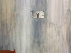
lynartist
5 anni faI don’t get the inspiration pic. Doesn’t look like much of anything I’m afraid! Measure out were you want your art to go; how large you want it it be. Tape it off for a visual. Are you keeping the wall like it is?lynartist
5 anni faYou could print up some of the pics ; tear them and create a large scale collage. Have it matted and framed.tdemonti
Autore originale5 anni faAs we speak, I'll keep the wall as is. Tge furnishing soften it.
The table stays until a replacement is found. A 42" round wood table with metal base is scarce in these parts. I was not in the market for a dinette when I found this set 17 years ago. I'm looking for modern but not mid-century or to the contemporary extreme. The house is a large mid-seventies split. It could be a custom build - definitely not cookie-cutter.
The inspiration photo is a statue in Barnet Park, Spartanburg, SC, titled Exuberance. A friend won first place in a photo contest with this photo and it was love at first sight for me.
Hanging small posters is the simplest finish As you know, it's all subject to change until the planets align. I have a tendency to hang art too high. Is this too low?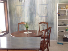
everdebz
5 anni faUltima modifica: 5 anni faI like it with top of bookcase [no need to reach top of window?]
tdemonti ha ringraziato everdebztdemonti
Autore originale5 anni faThe inspiration photo file is available and on its way. It could be made into a "mural or printed on 3 canvases.
Has anyone used https://www.muralsyourway.com/ ?


Ricarica la pagina per non vedere più questo specifico annuncio
User