Houzz Logo Print
jaxo_gw

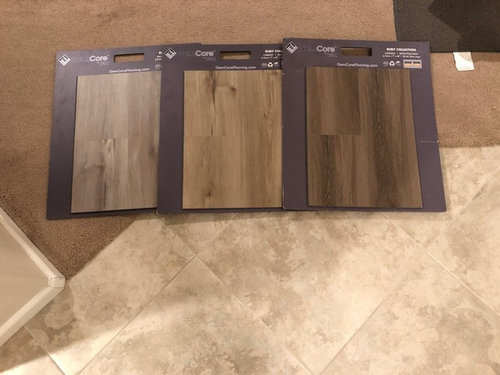
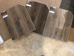
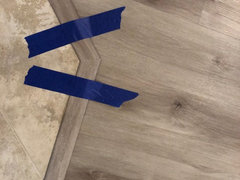
Which color looks best?

jaxo
5 anni fa

I'm replacing carpeting in the bedrooms and living/dining area.

The rest of the house will be tiled with the tile shown in the photo and the new flooring will be adjacent to the existing tile.


Which color best complements the existing tile?


Commenti (34)

  • PRO
    Beth H. :
    5 anni fa

    1 is best,,,3 is ok if you like darker. middle one is a bit yellowish.

  • Susan Davis
    5 anni fa

    I prefer the one on the left and do so as I agree with Beth H.

  • dyliane
    5 anni fa

    1 or 3

  • everdebz
    5 anni fa

    Wondering if wood look can have less grain somehow...

  • Lauren Barton
    5 anni fa
    My first instinct was the dark(3). However, after looking a bit more... I’m going to go with being the odd man out and say the mid range color(2). It contrasts nicely in a subtle way with both the wall and the tile, as well as picking up both the gray and warm tones from your tile. I also like that it has the least grain.
  • Olychick
    5 anni fa

    I think #2 is the best as it's most similar to the existing tile. #1 is way too gray, #3 is too dark.

  • Irene Morresey
    5 anni fa
    2 is the one I like
  • PRO
    Patricia Colwell Consulting
    5 anni fa

    I would like the darker one but it depends on your space to try to answer with no context makes no sense.

  • Karen Mikolainis
    5 anni fa
    Ultima modifica: 5 anni fa

    They all look good. My gut is voting for the middle.

  • jaxo
    Autore originale
    5 anni fa
    Ultima modifica: 5 anni fa

    I decided to get 3 samples of a different product.

    What do you think of these colors next to that tile?


  • Karen Mikolainis
    5 anni fa

    It depends on your style, but I like the two darker ones on the left.

  • lizziesma
    5 anni fa

    Either of the left two. So so so not the right side example.

  • everdebz
    5 anni fa
    Ultima modifica: 5 anni fa

    Cause I like a softer look, and more of a blend: number 3 -- is it a toasty appearance?

    Are there features in that area with dark: like beams, etc....

  • Zhoor .
    5 anni fa
    the first one on the left
  • cawaps
    5 anni fa

    From the first pic, I like # 2, followed by #3.


    From the 2nd set, I like #2, followed by #1.


    The mid-tone from the first set seems like a better pairing with the tile than the mid-tone from the 2nd set. Of the darker ones from each set, I think I like the 2nd better.

  • mimimomy
    5 anni fa

    # 1 seems to match nicely. 3 is dark and will show more dust as well as make your home darker (maybe that's o.k.). #2 is yellow and doesn't go well with the tile, in my opinion.

  • Olychick
    5 anni fa

    I think floors should be a backdrop to your furnishings and not the star (like your walls and ceiling). To my mind, they should either be one material (all hardwood, tile or carpet) or at least look cohesive by having different materials look as close to each other as possible in color/texture. Otherwise, you just have a hodgepodge of different flooring types that look disjointed and do not flow. The present carpet seems to be fairly close to the tile color/tone. I'd try to replicate that as much as possible and of all you choices, it seems #2 in the first set is the closest (from the pics at least).

  • Irene Morresey
    5 anni fa
    Hmmm still like the 2nd one in the 1st set
  • PRO
    Acanthus Interiors
    5 anni fa

    The lighter one on the left gets my vote as the transition between tiles is the most subtle. Keep in mind we’re all basing our opinions on your photo and everyone’s screen/monitor shows colour a little differently.

    Hope this helps!

  • sprtphntc7a
    5 anni fa

    #2 in first pic... softer and blends the best with tile and carpet...

    a bigger pic of space would help as well.

  • K Laurence
    5 anni fa

    #2 in the first pic ....

  • enduring
    5 anni fa

    I like the 2 darker ones. the lightest one looks too active in pattern to me. I'd like to see a more calm wood pattern to go with the tile. All of those samples are probably the same line though and all have the active pattern. It depends on how much tile you have too. Overall I think the darkest is the one I like the best, but I like contrast. The colors have to be spot on though, and only you can determine that aspect.

  • Paula Rogers
    5 anni fa

    I would go with the darkest color swatch, it compliments the darker colors in your tile. i think the lighter swatches would make it look washed out. Good luck!

  • Lei Cong
    5 anni fa

    I feel that with newer carpet, lighter colors bring out the newness

  • Ati Shirazi
    5 anni fa

    The second flooring would compliment the tile you chose, brightening up the home!

  • Lauren Barton
    5 anni fa
    #3 for the new set. It gives a softer, and more flowing feel. I also think it would stay more relevant than the other 2, when trends change in a few years.
  • jaxo
    Autore originale
    5 anni fa
    Ultima modifica: 5 anni fa


    I ended up going with this one.

    I'm going to repaint an accent wall a new color that will complement the new floors.

    Everything is still pretty neutral colors though.

  • PRO
    Acanthus Interiors
    5 anni fa

    Was this selection part of your 1st or 2nd batch? It's very nice!

  • jaxo
    Autore originale
    5 anni fa

    It was the first batch.

  • PRO
    Beth H. :
    5 anni fa
    Ultima modifica: 5 anni fa

    jaxo,,,looks nice. here are some paint colors you may like to try

  • everdebz
    5 anni fa

    Isn't it great that professionals comment for us houzzers, I mean it....

    so my 2 cents' worth is that with differing floors and whatever else is there for the eyes: think about lessening that visual busyness and have no accent walls.... ok thanks for 'listening'... :)

  • jaxo
    Autore originale
    5 anni fa
    Ultima modifica: 5 anni fa

    I do like those color options. So, I will likely end up picking something from those choices. I will pick up some samples this week.

    I plan to take down the mirrors and paint all the walls the same colors and the put up frameless artwork. Either one large rectangular piece or 4 small squares.

    I think i will also paint the ceiling the same color as the walls except add 80% white.

    White baseboards, doors and door frames.

    if the painter is removing all the door handles to repaint the doors, I may replace all the polished brass handles with something else.

    What door handle finish can I get that won’t look dated in 10 years?

  • PRO
    Beth H. :
    5 anni fa

    if we only knew what would be dated in 10 years,,,,,,

    Just do a regular door knob in a ORB, Black or Nickel. Do the handles or the knobs.

Sponsorizzato

Ricarica la pagina per non vedere più questo specifico annuncio

Italia
Personalizza la mia esperienza utilizzando cookie

Houzz utilizza cookie e tecnologie simili per personalizzare la mia esperienza, fornire contenuti per me rilevanti e migliorare i prodotti e i servizi di Houzz. Premendo su "Accetta", acconsento all'utilizzo dei cookie, descritto ulteriormente nell'Informativa sui cookie. Posso rifiutare i cookie non necessari cliccando su "Imposta le preferenze".