Design advice. Which do you like?
Nadia Regina Granados
6 anni fa

Sponsorizzato
Ricarica la pagina per non vedere più questo specifico annuncio
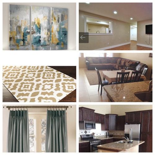
I'm just looking for someone else's opinion and design eye. House has a beige/gold theme, but I like the modern look of grey and whites. I am trying to find a way to make this beige/gold look and feel more modern. I decided on a teal and gold/yellow theme. Can you please tell me which combination of carpet and canvas you like? (Note: the pics are collages so you can see them side by side). I will use these as the base for the room and design around them. The right are pictures of the house and wall color (we will be keeping the couch).
Thanks!
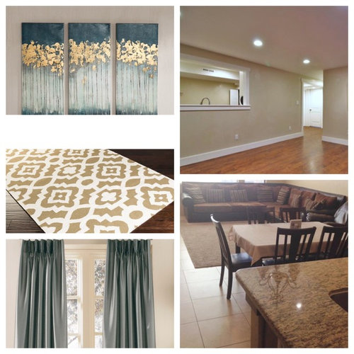

I like the FIRST pic, I have seen this canvas before and it has gold foil, it is really beautiful. I like the neutral rug. It is hard to determine what the difference shades are with the window panels. I would use the best color to tie the artwork in with the window panels. Your room is going to look great.
I also like the third pic best with your existing sofa - however, I don't like the color of the curtains. I'd use patterned fabric that includes the colors in the sofa, floors, and triptych, pulling in the bit of grey that you like.
The abstract artwork (4th photo) with the geometric rug (5th photo) create a more contemporary look.
The first canvas and the first rug are both a very good choice and go well together. They will be a little more modern to match what feel you are going for. Keep in mind modern colours are very neutral , so these will feel a little warmer then a plain modern space! Other wise, great choices, and they will look fabulous together.
Finding things that mix the gold and gray together is a good instinct. It's hard to mix warm and cool tones together. But if you find things that mix the two and strategically space accessories around the room to spread the combo, then it looks finished and intentional.
We originally decorated 13 years ago using camel/goldish browns (more yellow in the brown than gray.) Over the last few years, we have been updating & lightening our living areas by blending in grays & off whites I was surprised to see how well the brown/gray colors go together. There are lots of things out there (rugs, pillows, art, throws, etc) that have both colors. Blending gray & gold is pretty. We used SW Accessible beige for the walls. (It's a light greige without being steely gray.) I love your first combination! That artwork is striking!
Ricarica la pagina per non vedere più questo specifico annuncio
Houzz utilizza cookie e tecnologie simili per personalizzare la mia esperienza, fornire contenuti per me rilevanti e migliorare i prodotti e i servizi di Houzz. Premendo su "Accetta", acconsento all'utilizzo dei cookie, descritto ulteriormente nell'Informativa sui cookie. Posso rifiutare i cookie non necessari cliccando su "Imposta le preferenze".


CAGE Design Build