Houzz Logo Print
sfigu16

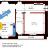
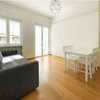
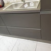
I need your honest opinion on this "mood board"!

sfigu16
11 anni fa
I decided to do a metallic browns and golds decor for my living room with my brown sofa. I was also thinking for the accent color to be either orange, blue or coral? What do you all think!?

Commenti (36)

  • Brian Triber
    11 anni fa
    Blues work best as a complement. Greens can also work, especially as a punctuation. If you go with oranges or yellows, they'll disappear or be mellowed by the golds and browns. So, it depends on wether you want to create a space that is comforting and embracing, or one that's energetic and lively.
  • sfigu16
    Autore originale
    11 anni fa
    oh okay i see. I would love something energetic and full of life! love your profile pic btw! it rocks!
  • PRO
    Voila!
    11 anni fa
    I would add texture and a variety of materials as well while playing with color. That could be done through your accent pillows, lighting and accessories. A coral would also be nice in this space, more on the pink side rather than orange, making the space feel warm and fresh.
  • PRO
    User
    11 anni fa
    Mix in metallic fabrics as well as an iridescent blue one.
  • PRO
    Springs Construction Company
    11 anni fa
    Concur with Brian on using blues. Also consider color study - a split compliment with blue as the key element with tiny splashes of yellow orange and red orange may give you the "pizzaz" I think you're searching for.
  • Donna Slyder
    11 anni fa
    what about using the soft teals that are all over the stores now. you can find great art work for inspiration first. then pull accessory colors around the room from the picture colors. cross over your accent colors in 3 areas of your room.
  • sfigu16
    Autore originale
    11 anni fa
    Thank you everyone for your ideas and suggestions, ASVinteriors i love those pictures! it would make the apartment so calm but still elegant
  • sfigu16
    Autore originale
    11 anni fa
    @Walter M. so i can mix the blues, gold and red orange?
  • PRO
    Springs Construction Company
    11 anni fa
    Yes and enjoy. Its classic color theory: here's a link to a color wheel - look at the split compliment.
  • sfigu16
    Autore originale
    11 anni fa
    Thanks walter!!! That is really really help! i do want pizzazzz!
  • danecarw
    11 anni fa
    Where did you get your couch? It looks super comfortable.
  • sfigu16
    Autore originale
    11 anni fa
    @dane i got the couch of craigslist but doing some research it seems to be from room and place. It is supppper comfortable!
  • PRO
    What's Inside Design Ltd.
    11 anni fa
    Ultima modifica: 11 anni fa
    Good morning,
    I did a side by side mock up for you. One using blues, the other using corals.
    Theres some brown & gold in the art, and both have some gold in the lamp and a toss cushion.
    I hope this helps you visualize!
    Caroline :)
  • PRO
    What's Inside Design Ltd.
    11 anni fa
    Different art.
  • sfigu16
    Autore originale
    11 anni fa
    wow caroline! thank you so much that really does helps! i think i will do the blue that looks amazing! Where is that lamp from??
  • PRO
    What's Inside Design Ltd.
    11 anni fa
    I'm happy the visuals help!!!
    The lamp is quite pricy, but there are knock off's out there if that suits you better!
    (I prefer the blue too)
    Caroline :)
    http://www.zincdoor.com/p/Currey-and-Co-Bangle-Antique-Silver-Leaf-Floor-Lamp__CU8024.aspx?SSAID=454769
  • sfigu16
    Autore originale
    11 anni fa
    Holly cow! that is a lamp with a price tag! haha its super nice tho . Maybe i can find something similar too. Again thank you for taking time out of your time to do this! Have a blessed weekend!
  • PRO
    What's Inside Design Ltd.
    11 anni fa
    My pleasure!
  • tamtoumi
    11 anni fa
    if you are going brown and gold, blue is a great complement but as the couch is such a solid item and the brown color makes it even more solid, i think using different shades , sizes and patterns of blue would help make things less static in the room. when i think of gold and brown, i think of turqoise and white.....in jewllery design for instance, turqoise is always set in gold and it looks so good on a tanned skin wearing white...so these colors complement each other. when i want to visualise if a bunch of colors go together or not, i always visualise them on a print wrap dress...i dont know why, but it always works for me to visualise colors that way and i can tell if they go together or not. hope this helps
  • PRO
    Design By Pisces
    11 anni fa
    no blues , add like green apple colors bright corals yellows and greens with silver as a accent
  • sfigu16
    Autore originale
    11 anni fa
    @tamtoumi I was thinking that as well to make it different shades of blues, golds, beiges and white. I want color!


    @pisces, that is an interesting mix. I have never thought of silver and brown and coral . I love that! I am going to look for that combination as well! Thanks!
  • Rebecca Montondo
    11 anni fa
    Shades of turquoise!!!! Think of Peacock feathers, an evening sky, gemstones. Google charmsoflight.com and look at the images. Your colors will jump right out at you.
  • stealthprettygirl
    11 anni fa
    Why are you doing browns? Everyone does browns and beiges! It's so ugly and boring! Think outside the box and do other interesting colors! Have you heard that there are other colors besides brown? Try greys, blacks or berry colors. Much more interesting.
  • sfigu16
    Autore originale
    11 anni fa
    prettygirl hi! i am doing browns bcuz mysofa is brown but i want a pop of color! i might try berry! now that i found out my curtains are too short. do you think a berry curtain would look nice?
  • PRO
    AlessandraDesign
    11 anni fa
    A berry purple color with a light teal color sounds lovely! Go for it!
  • sfigu16
    Autore originale
    11 anni fa
    I think i am! i am excited!! Thanks everyone!
  • sfigu16
    Autore originale
    11 anni fa
    Do you know where i can get some nice berry's curtains? I cant find anything!
  • tamtoumi
    11 anni fa
    berry purple is very nice with brown. i have a silver and choclate brown handbag which is a very unusual combination and i always get complements....nice mix, berry purple, silver and brown...nice...
  • PRO
    It's a Beautiful World!
    11 anni fa
    @sfigu16, here is some more color inspiration for you, both blue and orange :). Enjoy!... Raisa http://www.houzz.com/ideabooks/8111267/thumbs/Blue-artwork http://www.houzz.com/ideabooks/8190997/thumbs/Red-and-Orange-artwork
  • sfigu16
    Autore originale
    11 anni fa
    I love it! i love the blue so pretty and uplifting! I just saw a morrocan style living room! This would work just fine if i were to go down that way right?
  • PRO
    It's a Beautiful World!
    11 anni fa
    Ultima modifica: 11 anni fa
    Any number od things can work if done right. I suggest you create an ideabook for this particular decorating project and start collecting pictures that you like in this discussion and may use in your project. When they are all in one place, it should be easier for you to visualize your room and then finalize your decisions. Best of luck!... Raisa
  • sfigu16
    Autore originale
    11 anni fa
    Raisa, my mind is made! My living room is going to look amazing with this Moroccan style! Thanks for your advice
    I will definitely do that!
  • PRO
    Stoltenburg Staging and Interior Design
    2 anni fa

    Where are the mood boards

  • suedonim75
    2 anni fa

    Its an 8yr old thread!

  • poorgirl
    2 anni fa

    I just noticed that also!

Italia
Personalizza la mia esperienza utilizzando cookie

Houzz utilizza cookie e tecnologie simili per personalizzare la mia esperienza, fornire contenuti per me rilevanti e migliorare i prodotti e i servizi di Houzz. Premendo su "Accetta", acconsento all'utilizzo dei cookie, descritto ulteriormente nell'Informativa sui cookie. Posso rifiutare i cookie non necessari cliccando su "Imposta le preferenze".