Houzz Logo Print
mgiambanco

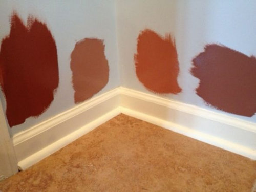
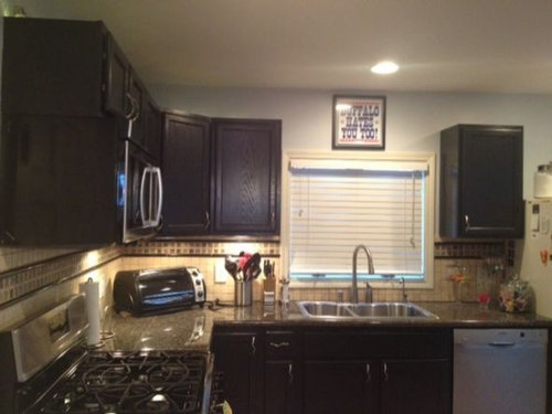
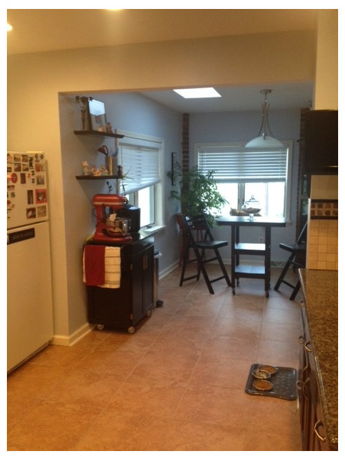
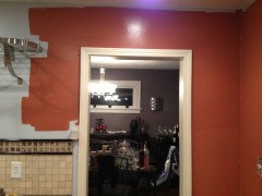
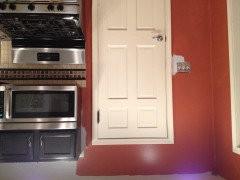
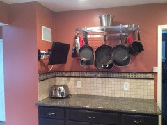
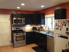
New paint for kitchen walls

Mario
12 anni fa
We're having a rather difficult time choosing a new paint color for the walls in the kitchen.

I've attached some pictures of the kitchen; we remodeled it just 3 years ago. The floors are an 18 inch porcelean terre cota color tile. The cabinets are stained black and the backspash is a mix of black granite and beige / tan porcelain.

We painted some swatches of colors we like on the wall. I'm just afraid of choosing a color too close to the color of the floor.

Any opinions?

Commenti (36)

  • Matt
    12 anni fa
    Far left. The others are not attractive.
  • Mario
    Autore originale
    12 anni fa
    the far left is the one I want, but the wife thinks its to dark with the black cabinets (she wants the third from the left). The countertops are a black / grey granite tile. I'd love to do a nice dark grey, but the dining room (immediately off of the kitchen) is a dark grey with a very light touch of purple in it. almost a dark lavander. We're not afraid of color at all; trying to pick the right one is the challenge.
  • PRO
    Charmean Neithart Interiors
    12 anni fa
    Third from left is best for your palette. The others are too red/pink. Orange and black always look good together. Good luck with your project. Charmean Neithart
  • Matt
    12 anni fa
    Better listen to Charmean. I'm a cabinetmaker by trade.
  • Jamieson
    12 anni fa
    Yup, I'd go with Charmean's pick. For what it's worth I'd be tempted to extend it into your dining area to create a more spacious look. The "Buffalo hates you too!" plaque above your sink cracked me up! Good luck!
  • Melinda Donnell
    12 anni fa
    I like the first one, looks Red and I love red, but I like the #3 one too, looks Orange. And I would agree with the above, carry it into the dining room. A rug with those colors would be nice under the dining tabe also. AND I think there might one at Walmart that would match.
  • kyme627
    12 anni fa
    I'd go for third from the left as well. Very nice color.
  • houssaon
    12 anni fa
    Ultima modifica: 12 anni fa
    I think the orange is the best choice. But another option is to go pick up the color of the tile with something like Benjamin Moore's Honeymoon. A golden yellow with brownish undertones, honeymoon can give any room a snug, cozy feeling and, depending on the lighting, it can be used as a rich, deep neutral beige. It will also work with the adjoining room in grey.
  • Mario
    Autore originale
    12 anni fa
    some of the comments and people in the office have been saying to tie the color into the dining room. what if i did something like this also -

    -

    i can score a projector from work for the weekend, draw a nice swirl pattern in illustrator and paint it onto the wall. theres a decent sized wall the side of the kitchen. i think it might be cool to do it in the same color as the kitchen. against the dark grey of the dining room, it should really pop out. ?
  • Lisa Ward
    12 anni fa
    the room appears very dark. but if you like deep I recommend Sherwin Williams Peanut Shell. it's the color of peanut butter
  • Mario
    Autore originale
    12 anni fa
    @Lisa will look at that tonight when we go - paint will be from SW (40% off this weekend!)
  • PRO
    AG Design
    12 anni fa
    I also think that combining the colors into the dinning room would work. Why don't you trying paining the sample colors near the wall that leads into dining room to get a better view how they would look in combination? I really like the red color and I would paint the wall with the window in the dining room with the same red color. You may want to load the pictures into an ipad or computer and use sketchbook to paint the walls with the sample colors so you can get a better sense of what they would look like. Be careful with yellow and black - I am thinking bumble bee. :-)
  • rzekamacleod
    12 anni fa
    Ultima modifica: 12 anni fa
    I too like the third from the left for your dining room and the same color lightened maybe 50% or so for the kitchen because of the dark cabinets. I like the idea of an area rug under the dining room table - maybe in a fun contrasting color with some black to tie it to the cabinets.
  • PRO
    Holzman Interiors, Inc.
    12 anni fa
    I just don't see it. I think that your chosen color intensity fights the black cabinets too much. I would cut those colors with white by 2/3's or find much lighter versions. A light melon color would be cheery and not look like Halloween. Try BM's #2156-60 or even lighter.
  • Karen
    12 anni fa
    Be careful though lightening those colors. A peachy flesh tone is not an attractive color but may be what you get if you lightened the oranges. I just think orange fights the creamy tones in your tiles and becomes monochromatic in a bad way with the floor.

    I still like mustard. Unless you go sunshine yellow it doesn't read bumblebee at all. Besides, yellow and purple are complimentary colors so it totally coordinates w/the purple grey of the dining room.
  • Jamieson
    12 anni fa
    Guys, I think yellow would zap the life out of the tile work. I'm just sayin'...
  • rmst
    12 anni fa
    I agree with prior comments and prefer an orange tone, but go to the earthier side with a lighter shade. It is better Feng Shui to have walls lighter than floors, also your black granite will be a great accent.
  • PRO
    Charmean Neithart Interiors
    12 anni fa
    Okay, I don't have an orange and black kitchen to show you, but take a look at these pictures. Maybe this will help you visualize...orange and black like each other (a lot).
  • PRO
    Kelly Clark Design
    12 anni fa
    I just did a search here on Houzz for "orange walls" and you will see many room scenes with blacks/dark browns in the overall room design---great way to get a visual:)
  • Jamieson
    12 anni fa
    Just take a cue from mother nature. The most harmonious colour schemes can be found!
  • Mario
    Autore originale
    12 anni fa
    So, my wife couldn't find the original swatch (and it was from bahr anyways) so Sherwin Williams tried to color match it. It came out just a touch darker but I like it. No turning back now...
  • PRO
    Faith Sheridan
    12 anni fa
    I like the orange and would consider adding an orange to the ceiling of the dining room. Grey and orange are a good combo.. or add the orange to another element of the DR.
  • Mario
    Autore originale
    12 anni fa
    Ultima modifica: 12 anni fa
    Burning the midnight oil? First pass. sorry, few pictures upside down (iPhone...)
  • Jamieson
    12 anni fa
    So far, so good! You Buffalonians (taking it your from Buffalo) are a tenacious bunch, burning the midnight oil to paint your kitchen! Well done!
  • PRO
    Charmean Neithart Interiors
    12 anni fa
    Looks good. Keep the pictures coming.
  • houssaon
    12 anni fa
    Looks good!
  • Mario
    Autore originale
    12 anni fa
    @Jamieson We're in Buffalo. With only the weekend to get stuff done... Woke up at 8am and just finished now at 5:30pm!
  • PRO
    Kelly Clark Design
    12 anni fa
    You have to be thrilled---looks fabulous!
  • PRO
    Barnhart Gallery
    12 anni fa
    Wicked! (Boston, here...)
  • vjs12
    12 anni fa
    Perfect!
  • Jamieson
    12 anni fa
    A-W-E-S-O-M-E!!! Hope you guys are thrilled! It really looks great!
  • PRO
    Charmean Neithart Interiors
    12 anni fa
    Yes! Pretty impressive paint job. Love the way it looks against the black.Well done.
  • Mario
    Autore originale
    12 anni fa
    Thank you everyone for your help and ideas. Natalie (my wife) does all the edge painting and I follow with the roller. Shes gotten very good at it (better than I in her words :)

    It really sets off the ivory trim color I think and goes well with the floor.

    -Mario
  • geo55
    12 anni fa
    Very nice! Colors give a warm and cozy feel.
  • bzugor
    9 anni fa
    What is the final color she used on the walls?
Italia
Personalizza la mia esperienza utilizzando cookie

Houzz utilizza cookie e tecnologie simili per personalizzare la mia esperienza, fornire contenuti per me rilevanti e migliorare i prodotti e i servizi di Houzz. Premendo su "Accetta", acconsento all'utilizzo dei cookie, descritto ulteriormente nell'Informativa sui cookie. Posso rifiutare i cookie non necessari cliccando su "Imposta le preferenze".