


Attività recenti

LOL @ "Hos and Pros"
I need to figure out a way to work that into a post
@Jan Moyer I don’t know why there continues to be a discussion premised on OP attempting to get something for nothing. OP has stated repeatedly that she had no issues with paying for the designer’s work
The question was solely whether having paid a significant amount for a design OP could use a different GC to build and get competitive bids or, as this company required would be locked into using their services and not be able to use the design which she had paid for in any way.
Many people indicated that many designers will provide a design for a negotiated fee and not lock the homeowner into a contract.
This isn’t how this specific company operates which is fine. However most homeowners would not want to pay for something which they would not be able to use after full payment. Per responses, there are many talented designers who provide designs for a payment which can be used as the homeowner wants without being tied to a specific builder especially without knowing whether the builder was competitive.

3onthetree, I did communicate with the original designer about the construction contract clause, and her husband (the designer/contractor) jumped into the email conversation and made assurances that were in direct contradiction to the contract language.
He began by stating that the clause was only in the contract "to prevent a homeowner or other contractor from using a partial set or non-complete set of plans to do the work. If this was done, even without our knowledge, we could be included in any legal matters as the original designer." I acknowledged this was a legitimate concern but pointed out that the contract didn't say "partial, preliminary or incomplete plans will not be released to the client during the design process," it said "all plans and specifications shall be for the exclusive use of and will remain the property of [company name] until a Construction Contract agreement for the proposed work is reached between both parties." I reiterated that I was only interested in design work and didn't see why a construction agreement needed to enter into that arrangement at all. He then said there was no construction agreement required and I quoted the contract (which had more than one reference to such an agreement) back to him.
We went back and forth for a total of eight e-mail messages, and he was either completely blind to what his own company's contract said, or he was pretending to be. Either way, I no longer felt confident in dealing with the company. I thanked him and said it wasn't going to work out, and have since very happily arranged to work with another designer.
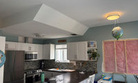

Were I you, I'd put a hold on buying cabinets for now. Until you have a solid plan, you'll just be setting yourself up for returns or "making do". Kitchen renos are expensive. Make your mistakes on paper, not in reality. Things I'd be thinking about:
1. How do I use my kitchen?
- am I a reheat the take-out person or a 3 course meal from scratch person?
- is this kitchen about function first or looks first?
2. How many people will be cooking at the same time? This affects whether you focus on a traditional "work triangle" or whether you set up work stations.
3. How much stuff do I have and how often do I use it?
- does all of it need to be in the kitchen or can some of it go elsewhere?
- have I measured my storage requirements to determine
- do I want to require a step stool to get at things stored near the ceiling? or would I rather that the cabinets not go all the way to the ceiling? Btw, if you don't want to pay extra for storage you won't use, you don't have to settle for cabs that stop shy of the ceiling. You can have a soffit added above the cabinets so that they become part of the wall instead of just sticking out of it.
4. Ventilation! A microwave hood is sub-optimal. They often just filter and recirculate the air over the range. Invest in a proper hood that exhausts outside. And if you do, pay attention to its noise rating. A quiet hood gets used more.
A few observations about the mock-ups you've posted:
- there's nothing wrong with an off-centre range. You don't necessarily need symmetry-- you need balance.
- if you add a wall oven, put it outside your work triangle. So, to the right of the fridge rather than the left. It doesn't see much use and space inside your triangle is premium.
- make sure you have a landing zone on the counter next to the fridge for loading and unloading
- A useful mnemonic for kitchen flow is "ice, water, fire". This means the fridge, then the sink, then the stove. For your plan (assuming you are right handed) that would mean putting the fridge on the short wall. This also has the advantages of putting the fridge closer to where the groceries are arriving, and getting rid of your "problem" of the off-centre range since you can line things up perfectly on the long wall.
And lastly, to echo the other posters, do get rid of that ceiling lump. It's horrible and you will regret not taking care of it. For the vents, if you put in soffits above your cabinets, you could potentially re-route the venting there.
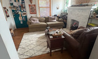
To-scale floor plan for the japandi rendering above (with a second chair added). Sofa will be off-center with the fireplace to allow space for the door swing.
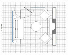

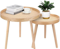
I really like your latest layout with the Japandi style. Even though it's not ideal to have the pathway in front of the sofa, it really does open up the space considerably. There's no obligation to have a coffee table either. You could do a small end table on either side of the sofa to set a drink or book and then have small round tables by the chairs for the same thing. If you can manage a set of nesting tables on the side of the sofa furthest from the door, you could pull one out in front of the sofa if needed.
If budget allows for a new sofa, look for one that is slightly smaller in length and with smaller arms. You'll probably have just as much seating space without the big rolled arms. I order online when I'm looking for a particular style and don't have to worry about being super comfortable, but for something I sit on a lot then I make sure to test it out for comfort.
I used some of the furnishings from your Japandi style pic for this one, as I like that style for your room. It's calm but really lets the tapestry be the center of the room. I like your wall art but felt that it needed to flip - easy peasy, and then added a new blue on the door that works better with your tapestry.
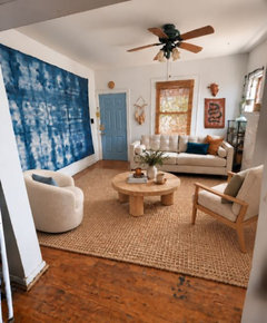
Added some additional lighting so you don't have to have harsh overhead lighting all the time. You can purchase new glass shades for the ceiling fan if your not ready to change that out, which will help update it a bit. Notice that ai changed the height of the bookcase, which I think works well with the sofa. Is your industrial bookcase one that you could shorten? If so, I'd consider doing that.
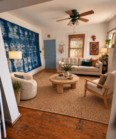
Ai makes the room appear larger than it is, but I think from looking at your original photo that you'd have room for everything pictured, but it may need to be adjusted - like the coffee table needs to move a little closer to the sofa. It's fun seeing your progression, so keep us posted.
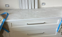

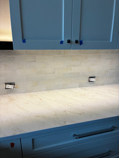
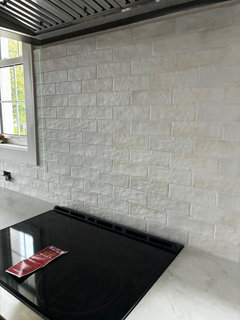
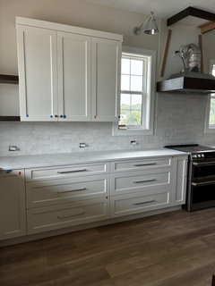
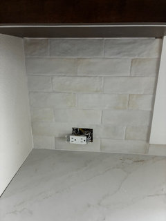
Just wanted to show my backsplash. Turned out perfect.

There are lots of ways to improve for not a lot of money. You mentioned you like the wall color but it’s not pulling the room together or working with the wood doors. The biggest bang for your buck is paint (walls and entry door). Step back, decide on a look and slowly make changes (try looking on line for ideas). It’s a great room to have some fun and here’s one example.
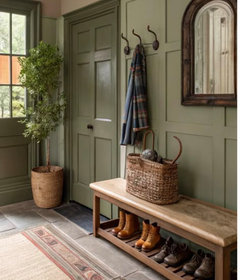
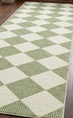
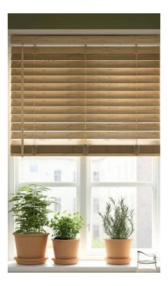
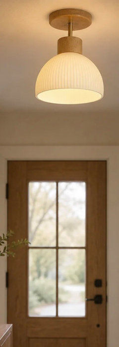

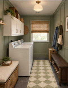
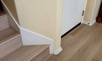

From what direction does the dominant light come?
Without that information, my suggestion would be Decorator's White trim, satin finish, Decorator's White for ceiling, flat finish, and for the walls, B.M. Linen White. Gorgeous combo. Carry around a paint chip of B.M. Muslin for the sofa color.
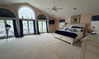

I woild get rid of the fireplace. It doesn’t add value. Simply love the sofa to a prime viewing spot for the view and worn arpund it.
I wouldn’t get rid of it or not use it. I just wouldn’t design around it. I would plan a spot for it and then move on. Sentimental pieces are special.
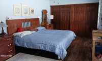
It’s better to consider the entirety of the room as each decision should depend on each other and base decisions on the drapes since you are keeping.
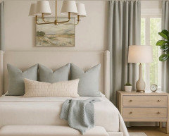
The nightstands don’t suit your headboard and my guess is you’ll be disappointed. Maybe decide if the new nightstands will add more to the room than your headboard. I just redid our master bedroom and am so glad I chose to replace the headboard…it allowed for more options and had a big impact.
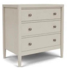
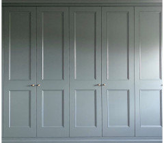
Once you lighten the bed area/bedding, the dark closets will feel less heavy. If you do paint…suggest painting the same as the walls. The dresser doesn’t have to fill the room…a comfy reading area for example would be a nice addition.
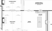

I'd center the table where it makes sense with the slider and then center the light over the table. A dining light that's ten inches off the table will be noticeable every day. The canopy sitting a few inches off-center within a ceiling square will mostly disappear once the room is furnished.
Since the ceiling is still open enough to patch, I'd have the electrician move the box and add proper backing in the sheetrock now, then repair the old hole in the beam. The rectangular canopy on that fixture may help visually, but don't use it to cover a junction box it isn't rated to cover. I'd also tape the 40 x 12 inch fixture outline over the planned table position before finalizing the drop. Have the electrician confirm the box, support and clearances.
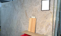

I’m lost here. Does no one use trivets, potholders, etc? Why would anyone sit a hot pan on any type of countertop unprotected?

And this is Cambria’s white cliff in a matte finish. With your wood cabinets and wood floors I think a solid counter - dark or white - will give you the vibe you say you want:
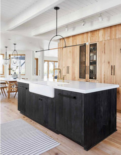
River White can have garnet deposits for patches and specs of burgundy. It has a geolgical 'gneiss' classification. Other granites to look at include White Valley, Viscount White, Copenhagen White and Silver Clpud. They have veining without speckles.
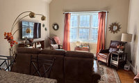
This is how I would arrange your space. If you use swivel chairs then you could have conversations with those in the kitchen too.
Install draperies that are off the window to create a larger looking window and help frame the sofa.
A round table in the center could be pulled away from the sofa enough to not interfere with the reclining sofa.
Add additional lighting to soften the look when you don’t need that much light from an overhead fixture.
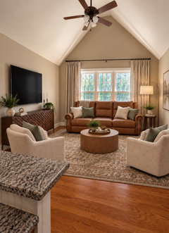
The reclining sofa is dictating everything. I know it was expensive, but IMO, it has to go.
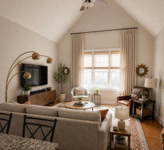
I asked AI to change the wall color, redesign the window treatment, hanging the rod higher and changing the drapes to a neutral fabric. Sofa color is important to me in your room, and I thought you might want to keep the rug. Here is the result:

Don't want to jinx myself, but it seems I'm able to order their remaining samples of this tile for a clearance price. I'm ordering the equivalent of about 2 extra boxes of what I actually need just to make sure (I'm getting all their last remaining samples of this tile). They are putting together the special order for me. Hopefully 4 boxes of the 6's worth are in good shape, minor scratches aren't a big issue for us. Somewhat relieved on this Monday lol
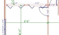

Another thought would be a walk in closet with a pocket door using that alcove for shelves but maybe hanging clothes as you do not say how deep it is. It would be small around 5x5 but useable with the proper double hanging space. You would have a small 5 x 7 ft bathroom but it would be large enough for a full shower, vanity and toilet. Add a window if you can into the new bathroom. With your idea of the bed on the slanted wall keeping the window in the same area till such time as you feel you want to change it out. If that wall is on the side or back of the house I would not hesitate to change the windows. If it is on the front of the house you will have to consider how it balances. Putting the bed on the slanted wall you want to make sure you have enough height so you do not bang your head. Also change the entrance door into a small entrance alcove off the hallway and move the attic door to match the bedroom slanted wall moving it out some. Last I would consider pocket doors. I have one and I do not care that it does not close fully. In our house when it is closed there is someone in there-enough said even if the dog pushes it open with their head to stare at you- Oh well. LOL!!!
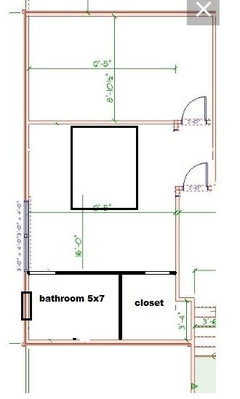
What about something like this? The shared bedroom closet/attic wall stays where it is. The bathroom is above the first floor bathroom to take advantage of plumbing. The door into bedroom gets relocated. Use IKEA Pax systems to either side of the bed for clothes.
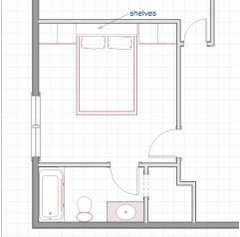
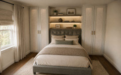
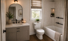
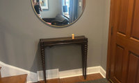
One idea is a mirror with narrow shelf. Add a door stop installed on floor so door doesn’t whack the shelf or mirror.

If you look on Pinterest for example and search “tiny foyer with stairs close to entrance“, you’ll see all kinds of ideas and will soon be able to narrow down what you like/be sure to tie it in to the adjoining room. Key are proportions and going vertical, as height will create a more balanced effect. Suggest a square rug to pull it all together.
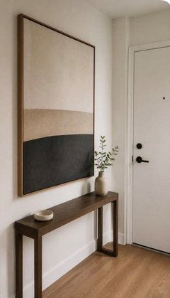
Consider as well a battery operated sconce.

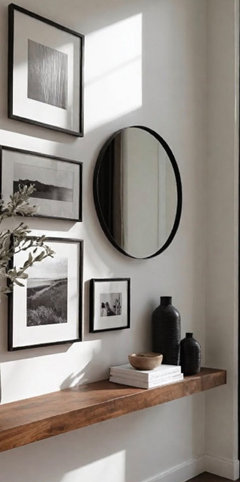
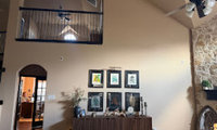
I think there is actually too much going on. The wall feels busy because of the two openings, the grouping of prints, and the numerous items on the console.
Suggest moving console over a bit to create more balance and add weight and volume to ground the wall/offset the openings and enhance the fireplace. Different proportions will really make a difference…less will be more.
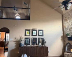
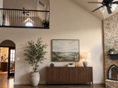


OP - I think going with white for the pantry cabinets is the correct decision. I didn't see your comment before posting my comment above this one - sorry for sending the other renderings. I had them - so, I posted them - but I was typing that comment when you posted your last one thanking everyone for their help.
@freedomplace1 - I don't understand your comment.
Thanks to everyone for all your great feedback! I appreciate all your suggestions.
OP thanked everyone in the comment posted about an hour before your last comment.
Are you offended because OP didn't specifically address your comment? There are many comments I've posted where the OP didn't specifically acknowledge my advice/renderings/etc. I've never expected an OP to specifically acknowledge my comments.
You should take your own advice -
If you are going to continue to show up here on this board to OFFER free design advice, you might consider investing in some manners.
@Max Lerner - get a life.
How many weeks out of the year do you have guests?
Will converting the second living room to an ensuite bedroom add to or detract from your home value? Your real estate agent should be able to answer this.
If you go through the major expense of converting to an en suite, it would be a shame not to use it yourself rather than leave it for occasional guests.

Looking forward to seeing a floorplan. without it, my guess is that a two bedroom house is usually worth more than a one bedroom.
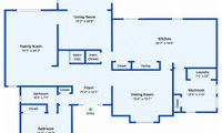

Have you considered bringing your current furniture with you to the new house and replacing it once you have lived there a year or so? That would take the pressure off now - when you are exhausted and overwhelmed.
I agree with apple_pie_order. Just use your old stuff for now. So what if it looks bad for now? No one cares. Better that than making bad decisions and spend $$$ on furniture you're going to regret and have to life with for a long time because you're overwhelmed and rushed. Take your time, the furniture stores will still be in business when you have the time and mental capacity to tackle this.
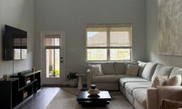

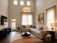
Your space already has a great foundation; it just needs a few finishing touches to make it feel more layered and cohesive. I would replace the oversized gray artwork with a slightly smaller piece that introduces warm colors and soft blues.
Add full-height, light sheer curtains on both windows, mounted at the same elevation to emphasize the room's height and create a more balanced composition.
A statement pendant light will help fill the vertical volume and make the double-height ceiling feel intentional. Finally, introduce a few more throw pillows in blue tones pulled directly from the artwork to tie the palette together and add depth.
These subtle changes will make the room feel warmer, more complete, and professionally designed without changing the furniture or layout.

It would not clash.
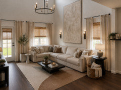
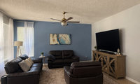
Take it in stages? This removes the popcorn ceiling and adds crown--but no wall moldings until you're ready to change the seating pieces. It repaints the blue wall with a more complex, muted blue with a bit of green in it. It adds/substitutes more substantial tables and console and larger art for better scale with the sofas and chair (but notice that chatgpt made the loveseat longer and the chair smaller than they actually are). It's your call whether you actually want to do that if you're planning to replace the seating pieces fairly soon. It replaces the sheer curtains with heavier drapes and the rug with a cream-colored, very textural one. (And I see it changed your floor lamp, which I didn't ask it to do. The tripod one is fine.)
This room is not as refined traditional as you probably would like eventually, but to my eyes and given the hefty seating pieces, it's a more visually satisfying space until then.
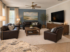
FWIW . . .
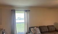
Okay, let's see how far we can make $1000 go to make the family room feel more complete. If you move the chair that I see in your previous post from the front living area to the kitchen end of the sofa, then that area just needs an end table and a lamp.
Here's an end table from Bed Bath and Beyond that is a reasonable size (about 2' diameter and height) and similar to the one in the AI image above for about $70 (with tax and free shipping)

And a pair of 25" tall table lamps from Walmart (couldn't find some similar to the AI image) for about $65 (with tax and free shipping) (link):

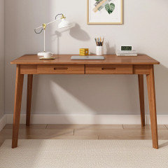
The far end of the sofa needs a desk (and will use one of the lamps above). Here's a desk from Wayfair for about $125 (with tax and free shipping) (link):
And a desk chair from Target for about $130 for two (with tax and free shipping; maybe the second one could be used elsewhere) (link):

(I would actually check thrift stores instead for a single chair for the desk.)
That covers the basic additions for the family room for a total of $390 (or $260 if you skip the chairs shown and find one in a thrift store instead). Thrift stores are also your best bet for affordable art and accessories. I volunteer at one that sells large art for $20 or so, decorative pillows for $5 each or less, throws for $5-$10 (unless you find items with a tag color that's half off!). You could use your C-table beside the wing chair, at least temporarily, and skip the ottoman until you find a bargain.
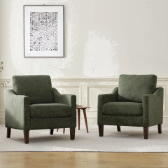
For the front reading area, here are chairs from Walmart for $320 for the pair (with tax and shipping)--and I didn't search beyond the first ones I saw (link):
An ottoman from Walmart for between the chairs ($100 with tax and shipping) (link)
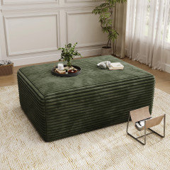
A 5x7 rug from Walmart for $45 (with tax and free shipping) (link):
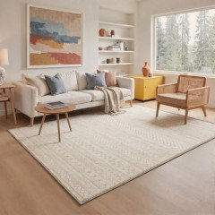
A couple of floor lamps ($45 each, with tax and free shipping) (link):

Which gives you a functional seating area (no bookcases or tables yet) for $550.
One way to spend just under $1000, at least . . .

Just to show how a contemporary chandelier could relax and update the room's formality:
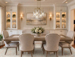
(This one is AI's choice, not mine.)
Suggestions on Houzz are always just that, @freedomplace1. Posters are always free to ignore those they don't find helpful.

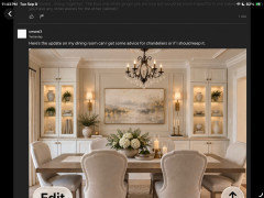
Here is the question about the chandelier
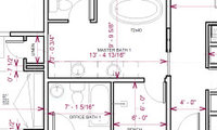

In this bathroom, nothing will be on the pocket door wall except a picture, maybe. Btw Btw, we had a house with a pocket door to a bathroom. Two double towel bars hung on the same wall, planned for, and in five years of little kids using them, no issue with the door.
Will the office shower go all the way to the wall?
I agree with using a vanity instead of a pedestal sink. There is always a need for closed storage of tp, toilet cleaner, extra soap.
What will the master bath vanity look like? Lots of drawers of varying depths?
Speaking from actual experience, with real experience living long term with certain features.
- Toilet Room: Yes! I’ve lived for years with both a toilet in the main bath (32 years) and a separate toilet room (last nine years in primary home and before that 13 years in second vacation home) and I love having it in its own private space. Honestly, I’ve never noticed a problem cleaning that small space and a good vent fan takes care of odor issues. That said, in your case I would steal 6” to a foot from the tub area to make yours a bit longer in order to close the door without hitting your knees while sitting. To get really personal, I leave the door open most of the time if I’m alone in the bathroom but there are occassions when I hear DH coming when I want to shut the door from a seated position. Love that you have a window in there!
- Shower: 4’ wide is plenty, thats what I have now and it is perfect for me. I have no problem with a bit wider, but you take a foot from the shower width you can vastly improve the office bath with no discernable loss. Yes, on the bench — love mine!! Oh, and one thing I noticed about your plan is that you have a view from the shower across to the big window. You will love that. I have a view like that from my shower and although it seems like a little thing, even with a steamy shower door, my view up canyon in the Rockies from my shower gives me pleasure every day!
- Tub: Are you a tub person? Actually, I am (or was) but I still built without one in the master bath because other things were more important (more on that to come). If a tub is important to you to use, yes, absolutely keep it, but if not rethink it. We had a freestanding tub in our vacation home and the problems we had is no place to put things and it didn’t stay as warm as my drop in in our old house. Both were cast iron.
- Vanities: You have ample room for two sinks and my husband and I are often both at a sink at the same time, especially at night. I don’t want to wait my turn when I’m tired and ready for bed. What we have and is perfect, is separate vanities. Each vanity is 4’ separated by a 4’ built in bench with storage below (I love having a bench in the bathroom, its amazing how often I use it — drying my hair, while brushing my teeth, putting on lotion
- Odds and ends: Medicine cabinets are great. Go for inset. You need more storage in the bathroom. That’s my one regret is that I could use a bit more storage.
- Your overall concept: Love it, and not too dissimilar to ours. We’re also in a Rockies ski area but in Colorado about six hour drive south of Jackson. In fact, we drove up to Jackson for a few days last week. We built a duplex with our DD and her DH and out DGS (actually he was born during the build — she found out she was expecting the same week we broke ground). Each side of our duplex is entirely self contained, but designed so that we have the ability to share guest spaces, while at the same time designed so that internal passages can be closed off so that each side could be sold separately (but not while I’m still alive — HA!) Our side is about 4,400 sq. ft. with our primary living area on the main level and a patio level with a second living area and two guest rooms which, while technically part of our unit, is accessible from DD’s side without coming through our primary living area. The ’kids” side is about 2,600 finished on their side with and unfinished but heated 1,200 sq ft patio level — perfect for 9 year old boys with a pool table, old couch and TV, Not to mention a whole side with fake ice and a hockey net. Other than the windows, the whole area is virtually indestructible!!!
Good luck with your build!
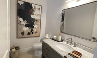
I like your idea of sticking with the same "visual language" throughout your home. You want a sense of cohesion rather than a random collection of rooms. That doesn't mean though, that you have to be super strict about how you do it-- you don't want your home to feel boring. If your trim and metal finishes stay consistent, that can be enough. Or if you want to vary those, you could stick with repeating a colour or shape.
What I'm finding jarring with the current state of the design is that mix of warmer tones in the floor tile and art vs the cooler wall colour. I'm also not sure (though this could be about the colour of the lighting) whether the vanity leans cool or warm -- did you get the fog colourway with brushed nickel hardware? If so, from pictures, that appears to lean a little cool.
Once you've found the right wall colour, it will all start to come together. I'd lean towards a mid-tone shade from either your floor or your vanity. You'll likely find that your art feels a little less emphatic when it is hung on a darker background.
Then it will be a matter of getting some discreet storage for under the vanity so that product is hidden; some matching/co-ordinating storage for toilet paper because back of the vanity isn't elegant; and some unpatterned, luxe towels-- your guests deserve it and your laundry won't be increased that much by changing them frequently.
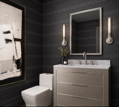
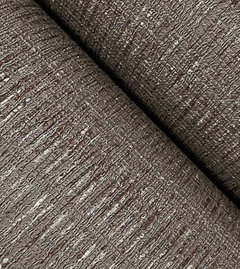
I searched to find a close up of your vanity and it’s lovely. Instead of a strong/floral wallpaper being the focal point (less can be more), I’d let the vanity, textured wallpaper and art create a lovely cohesive feel.
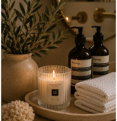
I think it depends. If it's a completely seperate area that closed off most of the time, then fine do something different. But if one room flows into the other then I'd do the same or at least something similar in vibe to the kitchen. From your pictures, I see the laundry room as an extension of the kitchen; if you stick to the same, it's going to make it seem like you have a larger kitchen and it will visually flow effortlessly, especially if you leave the door open most of the time.