


Attività recenti
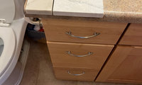

I haven't noticed what you are describing..
most comments here are not worth reading once led alone twice.
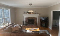
Your thought to close off the room might be the way to go since you want a larger tv. IMO it currently does not look right.
You would then purchase a longer tv stand and put the tv on a articulating mount and have them on part of that closed wall. Maybe you don't have to completely close the wall.

I would just put the TV in another room
I believe there are wall mounts that you can put above a fireplace, that allow you to move the TV down (in front of the FP) when you are watching. I'm guessing you wouldn't want to have the TV and FP going at the same time.
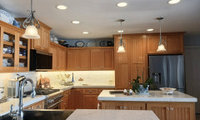

Guess I am the opposite. I don't care for recessed lights. I have some in my home but not in my kitchen.
I look at pendants over the island as task lighting. That is where we do our meal prep and prefer the light to be down where it is needed.
If you don't like pendants then get recessed. There is no right or wrong with this.
For a more opened look consider removing some of the items from the top of the cabinets and changing the style of the pendants.
Yep - wording is a turn off!

At the least, use waterproof laminate flooring. We have a rental house with laminate installed throughout by the previous owner. Pretty much destroyed in the kitchen. Wear layers scraped off under office chairs elsewhere.
Their legs/feet
Kitchen sink
Shower walls
Bathtub
their water bottle
toilet
Pics needed and do you really need a ceiling medallion.
I have chandelier that would supposidly light the ceiling but have no problem with it, because it lights the table as well, and there is also soft light coming from other areas in the room in an open kitchen, dining, living area. It is also on a dimmer which we always use, no need for it to be up on high. So I feel it works for us.
Doods, I find the same even with the smaller builder grade light we currently have- we use the dimmer often.
This was helpful. No one seems to think the medalion is warranted. It was just a passing thought and I figured I'd run it by the houzz crowd. Thanks for the helpful and nice comments. Also, I think autocorrect changed woodrose to woodrow lol.


The walls aren't bad. The duct, plastic pipes and black pipes are not good. I'd start with a colorful tile floor. You can get peel-and-stick vinyl tile pretty cheaply. Then, I'd paint the ductwork to match a color on the tile. I'd paint a coordinating stripe on the walls. Then, with some furniture, it might look quite different.

Wall panels - mural.


I think women often chose salad on a first date.
Hamburger
Chicken dish
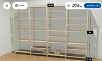

I would paint the shelving unit the same color as the walls.

That gold mirror looks lonely near the stairs. Have you tried it on the wall behind the chair?
Yep....Thumbs down to the ceramic flowers.
It's the Featured Answer at the top of the comments.
Omg. Looks so much better !
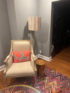
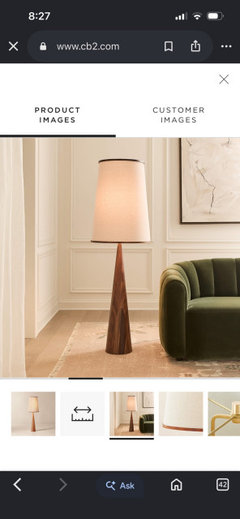
I liked the last arrangement so much. I took the first pic to see how it would look and the last 2 are things I am thinking of purchasing to replace items in this pic. Are they too disparate from the style of the room? I cannot thank everyone enough for helping in this process. The last little photos are things I like but may not complement. Thanks again for this arrangement and all the helpful advice provided




Consider maybe.............A rolling cart that can house your microwave.

You would keep it here - white circle or on the opposite side.

Many, Many to choose from. Just a suggestion but might not work for you.
@thinkdesignlive: That's a great idea, but I would recommend a beautiful wide sideboard rather than a continuation of cabinets--just to add more elegance to the dining end.
Lots to chew on. Thanks to everyone for their advice - much appreciated.
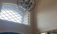
Take pics of the entire entry...Thanks.

I’d coordinate the two fixtures rather than try to match them exactly. Since the retained dining chandelier already has a slender candle-arm character, the entry could take a more sculptural but less layered silhouette. That would give it its own identity while reducing competition with the arched, gridded glazing behind it.
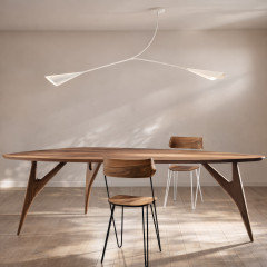
We’re GREYGE, the designer of CALLA, which is produced in Italy. I’ve attached an image because its sculptural pendant form could be a useful direction for this style decision. I wouldn’t assume it is the right scale or drop for the entry until the dimensions are confirmed, though. What is the entry ceiling height?
You can see more of our work at https://greyge.com


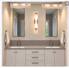
It’s a good and simple compromise. The lighting will not be ideal but definitely better than half face lighting.

One sconce in the middle is worse than none. It lights the inner cheek and throws the outer side into shadow, which is the opposite of what a mirror light is for. With 3 inches between the cabinet and the side wall, a real sidelight will not fit, and a fixture crammed there will read as an afterthought.
Keep the cans for the room and put the face light on the mirror. A Robern with an integrated light, or a light bar above each cabinet, lights the face from the front and does not need the side wall. If you want a decorative sconce, one pair centred in the 30-inch gap can mark the middle of the vanity. Do not expect it to light either face evenly.
Height, if you do add them, is eye level at the shade, not at the canopy. And the box has to land before the mirror is hung. Moving it after the cabinet is up means opening the wall.
We set vanities, mirrors, and the wall around them on bathroom renovations. New wiring is a licensed trade, and we flag that before the box is cut.
The Handyman Victoria works on houses across Victoria and nearby neighbourhoods, including Saanich, Oak Bay, Esquimalt, and View Royal.
Phone 778-561-4808.


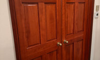
That looks like vinyl in the kitchen. Maybe there's hardwood underneath the carpet.
I assume you have a logical reason to avoid the wide plank pale flat cut European Oak engineered flooring going into higher end new constriction. Monarck Plank, Hakwood, Hurst Hardwood and every other floor company has this product.
You can now look at the improved waterproof much thicker laminate options. They are very realistic. You'll avoid the problem of a less than very flat subfloor you can find under the carpet.

Will suggest slate flooring at least for the kitchen. That should provide a good foil for the cherry cabinetry.
can't find the phone.
They walk into a room and can't remember what they are there for.
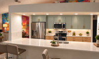

You think you can have this with 4000k led? Nope........
It may be too cozy for you, but this is where I may never leave unless dragged out. AI or not, put me here, send in snow, rain......sleet.......
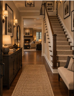
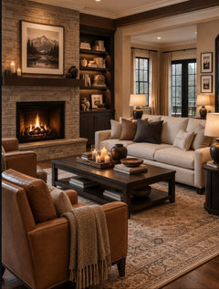
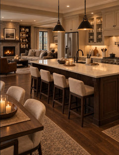
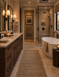

To me lighting is deeply personal, and trying to force one "sweet spot" number like 3500K or 4000K in every room of every home misses the mark.
Mother Nature doesn't give us one flat light all day. She gives us bright, crisp, white sunlight during our peak productive hours, and then rolls out that soft, warm, amber glow in the early morning and evening when our brains need to wake up or wind down. Why shouldn't our homes do the same? When you’re trying to figure out what works, it really comes down to a few big things:
- How you want your home/room to feel: Do you need to feel energized and focused, or do you want to instantly drop your shoulders and relax after a long stressful workday?
- Your decor and furniture style: The era of your home makes a huge difference. If you have a 100 year old home filled with rustic antiques, a harsh white light is going to make the space feel sterile and cold instead of rich and inviting. On the flip side, if you have an ultra-modern, minimalist look softer, more yellow lighting can feel heavy and drab.
- The colors you love: Light changes color completely! If you love shades of dusty purple or deep wine reds, a yellow bulb is going to turn those gorgeous tones completely muddy and dingy. But if you lean toward cozy fall colors, a super bright white light can make them look garish and way too vivid.
Another huge trap people fall into is confusing the amount of light with the color of the light (lumens vs. Kelvins). A lot of times, people buy a cold, bright-white bulb because they just want to be able to see better in a dark room. But then they end up with a space that feels like a sterile hospital wing! If you need a room to be brighter so you aren't squinting, you don't need a whiter bulb—you just need more lumens (the actual volume of light). You can absolutely have a space that is beautifully lit and easy to see in, while keeping the color temperature in that cozy, warm yellow range.
Personally, I say throw out the rulebook and mix it up! In my own bedroom, I have bright white lighting in the areas where I'm getting dressed so I can actually tell my navy from my black. But by the bedside? It’s strictly soft, warm yellow lighting. When I'm unwinding with a book before sleep, the last thing I want is to feel like I'm sitting under a pharmacy fluorescent.
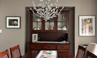
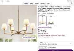

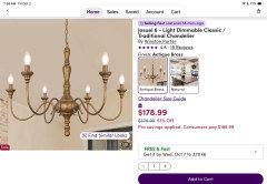

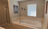
@shirlpp … & clean also. We have one, put in by builder , never has been used in 7 or 8 years. Just haven’t gotten around to have it removed , we still have extra flooring, want to place a nice upholstered bench in its place.


not a pro but I really think the two toned cabinets would be a lot for a really small kitchen
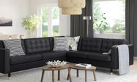
Do you have pics of the main sitting room to share.
Thanks for the link—that's the MORABO 5-seat corner sectional. IKEA lists GRANN leather on the contact surfaces, but BOMSTAD coated fabric on other panels, and the cover isn't removable. So I'd check those seams and surfaces in person rather than treating it as all-leather.
On comfort, your own test is more useful than the photo or reviews of a different IKEA sofa. If it felt firm, I'd go back and sit in both a straight seat and the corner for 20 minutes in the posture you'd use for TV. Check lower-back support and where your legs naturally land; I wouldn't order it assuming the foam will soften enough to change a fit you already dislike. The model's buyer feedback is mixed, so I can't honestly predict long-term comfort for you. Black can simplify some cleaning, but dust and scuffs may still show—I'd choose it only if the comfort test works first.
I like the tufted detail on the Morabo. I guess I'd replace the poly foam with medium weight latex foam from Sleep On Latex.
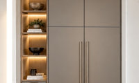

The surrounding clutter throws them all off in my opinion. None of it looks like where a kitchen fridge would be. The surround makes it look more like a closet.

Chose clothes to wear for the day
Answered a phone call or texted

Watch TV

So don’t run with toothbrush or scissors.
I read that Kelly (sp) Ripa damaged her gums because she vigorously brushed back and forth across her gingiva/gums. OUCH! Get an Oral B electric and follow directions — gentle touch! You’re not scrubbing a pot, Ms. Ripa.
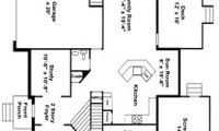
Are you completely gutting the kitchen? All dimensions are listed except for the kitchen.
This is an example of what Jan is asking for. It's taken from the Featured Answer in the "New to Kitchens? Read Me First!" thread.
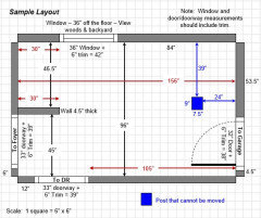

At this stage, it is purely conceptual (though you have to have a handle on proportions and sizes, and be able to picture the floor plan in 3D) so exact dimensions are unnecessary.
The proposed Dining Room does not work well being open to the Family Room in that manner. It creates a "one-sided" furniture layout because of the circulation required to pass through the skinny 14' wide Family Room. And is way oversized and not kitchen-adjacent.
The Game Room/Golf Simulator location would have an odd access being entered from the Kitchen or only outdoor. It probably also needs to have a higher ceiling. Since you don't have a basement, but have a sloping down back yard, I would suggest it be lowered with stairs down into it. I know of a couple examples where the golf simulator was an addition and the house overlooked into it.
The problem this popular builder's plan presents is the angled circulation toward the Family Room, with the stair creating a "skinny" width for a Kitchen (hard to fit the desired island) and a bearing wall/roof change along the Dining Room wall. One solution is to extend the Sun Room (originally a Breakfast Area) out as a full Dining Room.
Also note that you cannot just build a permanent room on top of a deck and be successful, it was not designed for the same purpose.
Had a glass of wine
What rox posted…100%! I just did it and found forgotten things.



Call an electrician asap and have them relocate the light switches, before putting anything on that wall.
Thank you everyone so much for the new ideas! A gallery wall seems to be the way to go to blend in with a light switches. I just didn't know what to do with above the toilet after that, would more hanging artwork be too much? To answer someone's question, my towel hangs on the shower glass with a pretty hook. I keep one hand towel on the sink that matches. That's all I need because it's just me. Great idea about turning the cabinet the other way! The original plan for the bathroom was to have a built-in right there with a bench under the window but cost Gott prohibitive. I will definitely look into that more. And I love the Roman shade someone put on the window with the edging. I was looking for away to bring in some color without clashing and that's perfect!


You've already received some excellent advice, and the images people have suggested look very nice.
Wallpaper is a good idea if you can find the right print.
I love print and color; do consider stencils instead of wallpaper. Stencils allow you to get just the shade you want, and humidity won't cause the edges to "roll up" in future years. Stenciling is extremely slow work, but it's not at all difficult. The secret is to use a flat stencil brush and wipe off practically all the paint before you begin -- your brush should be quite dry. Practice first on a piece of poster board.
If you're interested, check out Royal Designs or Cutting Edge. No, I'm not affiliated -- just like the products.
If they're not wearing shoes (and I'm expected to remove mine).
Paint colors
Floor choices
How tall the ceilings are
Something like this for watching tv, gaming and sleeping.
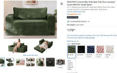
You could put one or two of these in the closets and roll out when needed.

First empty it then a to scale floor plan I will say family movie night and sleep overs usually do not work together for sure not with teens .Ask the teens what they want IMO since this will be their space and honestly no office either . Gaming is a big thing for some teens that requires some different seating , and do not forget sleep spaces .

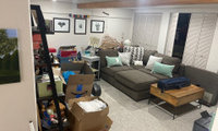
I’d start by clearing out the boxes, loose items and extra small furniture, including the white console beside the sofa. At the moment, the things behind and around the sectional are taking up a lot of usable space and pushing the seating into the middle of the room.
For everyday use, I’d keep the sectional in its most compact configuration, with any pull-out or reclining sections closed, and bring the coffee table closer to the seating while leaving comfortable legroom. I’d keep the main furniture to a simple combination: the sofa, coffee table, and a low media cabinet with the TV mounted above it on the opposite wall.
For the office, I’d explore placing a slim desk against the wall with the three pictures, behind the sofa, with a chair that tucks underneath. I can’t tell from the photos how much depth you have there or what those doors lead to, so this would depend on keeping the doors usable and leaving enough space to sit and walk through. If it fits, the sofa back would help screen the work area from the rest of the room.
Once the extra furniture is gone, I’d soften the room with full-length curtains at the windows, a compact decorative ceiling light suited to the ceiling height, and a table lamp for softer evening lighting. For the dark sofa, I’d choose larger cushions in warm ivory and deep teal, mixing a subtle pattern with textured plain fabrics, plus one soft throw. That would make the room feel more cohesive and welcoming for the whole family.
I’m an interior designer, and I made a video showing four different styles for the same living room while keeping the furniture layout the same. Once you’ve cleared the space and settled the practical arrangement, the examples could help you see how lighting, curtains, colours and décor work together to change the room’s character and choose a style that suits your family:
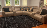

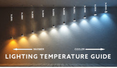
The bulbs in the ceiling downlights are the wrong color. Too cool. You're at about a 5-6 and should be at 3
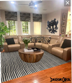
IMO your were heading in the right direction with the area rug style, but It's a bit too black for the space. See how much for interesting the space becomes without that black 'hole' in the floor.

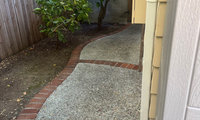
Donate the red brick.

Choosing high-quality turf with heat-resistant technology and professional installation. Great solution, drains, pet friendly, and, if you have snow, easy to shovel if you go in the right direction...snow just pushes off. It easily be installed right over the cement...that what we did and after 6 years looks perfect.
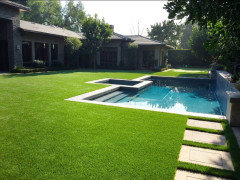
(Not my yard)


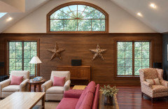
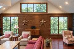
Since you like the view and the light, I’d enlarge all of these windows. The size and shape of the upper window may depend on how custom you are interested in going.
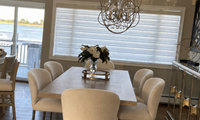
Any....that won't break the glass in the buffet when pulled back.
I love your second choice. You might consider adding dark draperies to “frame” the window.
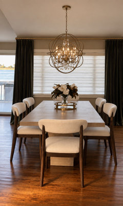

The first ones would certainly be the ones I would choose! I just went out and purchased a set of similar chairs recently and I am very pleased with them, my husband is as well. They are super cute and match our dining room! We've already had a few guests over and everyone who has seen them have loved them. Some even inquired where we had been obtaining them from! They are comfortable, they look great and I'm happy that we went with them. If you're fond of the first ones, then by all means, try it!
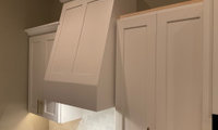
Crown that does not protrude as much and add crown around the ceiling. It will look nice.
How high is the ceiling? Is it vaulted? To me, cabinets that don’t go up to the ceiling look awkward and cut off. The hood protruding above them emphasizes this awkwardness.
Since the hood is slanted and won’t be flush with the cabinets, i think putting molding on it that matches the cabinets is what makes it look odd. i would remove the molding from the hood and make it smooth so the hood is distinguished from the cabinets rather than looking like a mistake.
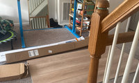
NO.... no no. far too gray, very "faux" stripe effect. : (
Keep shopping and there are MANY that will take the abuse of renters and Lifeproof is not the only brand.

Sleeping
Relaxing
Being with family
Long soak in bathtub
Watching the grass grow
Watching tv
Online or in person - I wonder.
Comparison shopped - store to store or website to website.
shirlpp, likely both online and in person.
bring measurements of the room


Pull weeds
Power wash their house
Decorate the house/yard for the holidays
Put up a Ring camera
Start a garden, vegetable or flower

Come up with a new hydronym
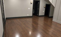
A few chairs with a few games.


Yes, the arrow would be the path of how you could potentially walk/run to the doors from the stairs. The left door too is accessible now, unless you don't need it . In that case a console table by the door and stairs can be useful too.
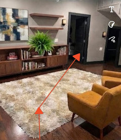
You could also just keep it open with only a few furnishings. Your family’s needs may change and then you’ll will have a better idea of how you want this space to function.
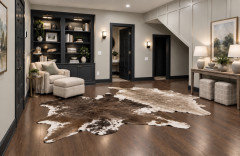

Did you see the no-drill curtain rod holder that I posted above.
Another angle
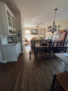

Perhaps something even narrower like this would work https://www.chairish.com/product/4777356/english-mahogany-cabinet

^^^^ In a high pitched voice.
tj
Moved back a bit until sure about how friendly the dog is.
Asked if the dog is male or female.
Just curious as to why it has to be custom. There are many, many non-custom mirrors to choose from.
I agree with other posters - find a local glass shop to see if they can make your custon sized mirrors. Would not recommend having them made elsewhere and having them shipped.
I’d be worried about it being damaged in shipping given its size (if you can even find a supplier). Suggest having a mirror cut locally and to customize, this link might be of interest and there are lots of options.
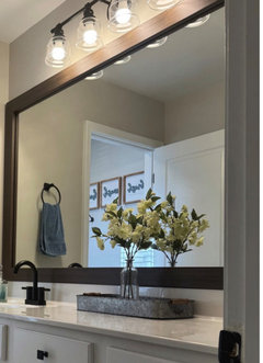
https://framemymirror.com/products/upton-dark-walnut-sample?variant=43321843482858
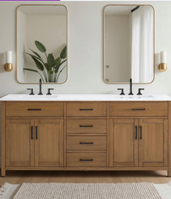
Another idea, if the vanity has two sinks consider using matching mirrors that could be sourced locally.

I agree about the scratches and the corner looks like it was repaired.

Lowest cost fabricator searched for, with COM. It’ll get blamed on the COM. Because there is no accountability to 3rd party anything.
The fabricator supplied the stone and installed the stone, so from start to finish they have been accountable. There is no third party involvement. I used a reputable company that's been around for 50 years so I expected a much better result than what I ended up with
Create their own social media content

Take some ‘magic’ supplement
Try a new beauty product
Make their own dinner
Make their own stink bomb, hornet spray, fish cakes, hot rod.
I'd go with the white/white so the sink looks nice with the countertop.
sink and toilet are white and the features in the space. The floor is secondary in your case, so work with it.
I'd paint the walls to compliment the floor and shower tile.