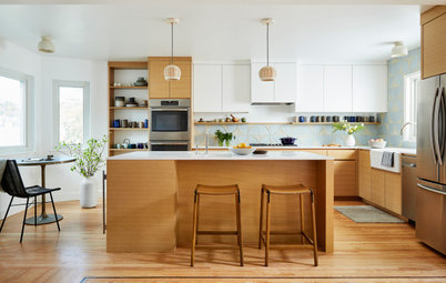
Kitchen of the Week: A Mix of Celadon Green and Warm Walnut Wood
A designer helps her clients edit their ideas to create a special place for the whole family

These Massachusetts homeowners, parents of a young daughter, had a strong sense of their personal style as they remodeled their home room by room. But when they got to the kitchen, they knew they needed help from a pro. They called designer Heather Aordkian to help them turn their ideas into a cohesive and functional design. “I could see from some of the other rooms they’d finished that they had a really great dynamic style. When they shared their inspiration photos, they were worried that they were all over the place,” Aordkian says. “But I could see that they loved a bespoke look that mixed cabinetry, countertops, hardware and metals and told them, ‘You’re actually not all over the place.’ The key was to pull out the common threads and find sweet spots of connection.”
After talking at length about how the current kitchen did and didn’t work for them, Aordkian came up with a plan that preserved the work triangle, showcased a large existing window and added an island. As the design process progressed, they landed on the idea of mixing walnut cabinetry with cabinets painted a calming celadon green. The new, more open feel and personalized touches such as a special spot to display their daughter’s artwork make the new kitchen a favorite spot in the house.
After talking at length about how the current kitchen did and didn’t work for them, Aordkian came up with a plan that preserved the work triangle, showcased a large existing window and added an island. As the design process progressed, they landed on the idea of mixing walnut cabinetry with cabinets painted a calming celadon green. The new, more open feel and personalized touches such as a special spot to display their daughter’s artwork make the new kitchen a favorite spot in the house.
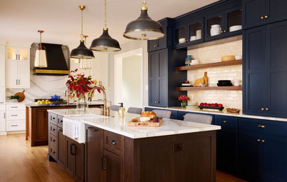
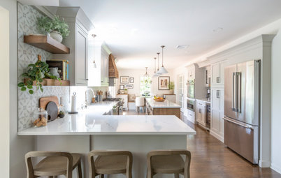
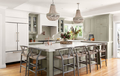
After: Now the homeowners can enjoy the lovely large window while working in the kitchen, because Aordkian removed the peninsula and the upper cabinets that partially blocked it from view. She made up for the lost counter and cabinet space by extending the lower cabinets under the window. With the peninsula gone, she had room to add the eat-in island her clients wanted, which provides additional storage.
The designer added a pullout trash and recycling cabinet next to the dishwasher. “I do this in kitchens whenever I can — it gets trash cans out of the way,” she says. Another welcome change was installing a microwave drawer, which opened up space above the range for a vent hood. The tile backsplash and sleek hood create an airier feel on that wall.
Cabinets: Kitchen Magic
The existing work triangle layout had functioned fairly well for the couple and Aordkian didn’t change it much. But now they have the island for additional prep space and for placing things as they pull them out of the fridge. The homeowners chose the large-format floor tiles, which have a natural stone look.
Fitting in an island that had room for storage and seating as well as enough clearance around it was a little tricky. “My clients wanted a large island, but it was important to leave at least 36 inches on the sink side and 42 inches on the fridge side for clearance. We needed room for things like the dishwasher, range and fridge doors to open, and the spaces on either side of the island were going to serve as important pathways,” Aordkian says. She notes that she always arrives with blue tape so she can lay out the island’s footprint on the floor. This helps clients visualize how the space will work.
The most important element of the island for the homeowners was seating. “Wrapping the seating around two sides makes it easier for people to talk to each other,” Aordkian says. “And I like to keep the seating area out of the work triangle so that the cook can work.” The fridge’s location makes it easy for people to grab drinks without getting in the chef’s way.
A clear glass globe pendant keeps the view above the island visually light and open. It also doesn’t draw attention to the fact that the ceiling is relatively low.
Browse range hoods in the Houzz Shop
Because the ceiling isn’t high, the designer suggested tiling the backsplash all the way up to meet it. “This gives a more finished look and it also gave the homeowners the bespoke style they were looking for,” Aordkian says. She also extended the cabinets up to the ceiling to avoid the dust that would otherwise settle on top of them.
The corner cabinet houses a lazy Susan. The designer used two cabinet doors hinged together in the corner to create a wide opening for access.
Find a local cabinet pro
The corner cabinet houses a lazy Susan. The designer used two cabinet doors hinged together in the corner to create a wide opening for access.
Find a local cabinet pro
The homeowners loved the idea of using champagne bronze on the hardware. “It goes so well with the celadon,” Aordkian says. “I’m usually a ‘knobs for doors, pulls for drawers’ person, but my clients wanted to mix it up and knew specifically where they wanted each piece of hardware. This mixing helped give them the bespoke look they wanted.” At the same time, being consistent with the champagne bronze finish provided one of those sweet spots of connection Aordkian knew they needed.
The countertops on the perimeter cabinets and island are Viatera Lumina quartz, which resembles white marble with subtle gray veining.
Cabinet hardware: Amerock
The countertops on the perimeter cabinets and island are Viatera Lumina quartz, which resembles white marble with subtle gray veining.
Cabinet hardware: Amerock
Aordkian suggested a pendant light over the sink rather than a recessed one. “This spot is almost always a great opportunity to add some texture and warmth to the space — it’s like a piece of jewelry for the room,” she says. The oil-rubbed bronze finish is repeated on the light fixture above the island.
The designer encouraged her clients to mix metals. “Mixing is great, you just have to repeat each finish,” she says. “For example, the stainless steel of the faucet is repeated on the appliances and the oil-rubbed bronze on the pendant is repeated on the island pendant.”
Shop for kitchen lighting
The designer encouraged her clients to mix metals. “Mixing is great, you just have to repeat each finish,” she says. “For example, the stainless steel of the faucet is repeated on the appliances and the oil-rubbed bronze on the pendant is repeated on the island pendant.”
Shop for kitchen lighting
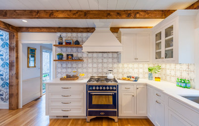
Before: The pantry wall had a kitchen desk that mostly served as a spot to dump things. The garbage and recycling bins tucked underneath the desk illustrate what a great improvement placing pullouts in the cabinetry was.
After: Here’s where the walnut cabinetry came into the mix. The richness of the wood warms the room and nods to midcentury modern design. A pair of glass cabinet doors add a light spot in the middle of the dark wood and reflect light from the window.
The deeper cabinets on the right are pantry cabinets with rollout drawers for easy access. The adjacent cabinets are shallower to allow more space for the island seating. This area serves as a coffee bar.
“I always like to give people a coffee bar when there’s enough room to do so. And when I do, I like to make the upper cabinets above it higher than standard,” Aordkian says. “This allows people to lift the top of the coffeemaker without having to slide it out from under the cabinets.”
The homeowners came up with the cork backsplash idea to meet an important need. “This spot was designated for pinning up their daughter’s artwork,” Aordkian says.
With the change in cabinetry on this wall, it was a good spot to take care of another one of their wishes: using different countertop materials. This countertop is Viatera Lento quartz, which is gray with light veining. To pull common threads together among the different elements, the designer found two countertops that resembled the inverse patterns of each other.
New to home remodeling? Click here to learn the basics
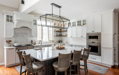
Removing the upper cabinets along this wall opened up the room and made the most of both windows. “I suggested floating shelves instead of cabinets here because it kept things open and because it was a great opportunity to bring the walnut over to this side of the room,” Aordkian says. “They loved the idea.” This is another sweet spot of connection.
The floating shelves keep the views out the large window more open and don’t block light like upper cabinets would.
“This was a very special project to work on — the clients were so wonderful to work with,” Aordkian says. “It was so much fun to study all their design ideas, pull out all the parts that worked well and see all the pieces come together.”
More on Houzz
Read more kitchen stories
Browse kitchen photos
Hire a kitchen remodeler
Shop for kitchen products


Sponsorizzato
Ricarica la pagina per non vedere più questo specifico annuncio
Kitchen at a Glance
Who lives here: A couple and their young daughter
Location: Reading, Massachusetts
Size: 195 square feet (18 square meters); 13 by 15 feet
Designer: Heather Aordkian of Kitchen Magic
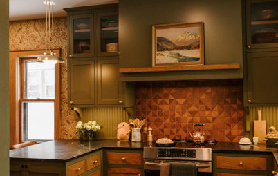
Before: The kitchen was dark and didn’t suit the homeowners’ style. The upper cabinets blocked the light and views from the windows, while the peninsula crowded the space and blocked it off from the living room. One fabulous existing asset the homeowners loved was a large window, located just to the left of this photo.
Find a local kitchen designer on Houzz