Bathroom of the Week: Contemporary and Classic in a Master Bath
Clean lines, reflected light and large-format tile make this chic room in Utah feel large and spa-like

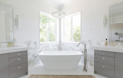
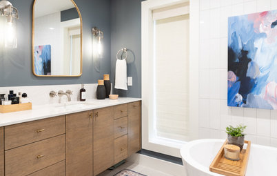
These Utah homeowners were expecting their fourth child and were deep into the nesting phase when they signed on with interior designer Andrea West. They were eager to make their dark and cramped master bathroom feel luxe and calm, as they knew those precious minutes they could take to relax would soon be few and far between. “We wanted to give this space a big design in a relatively tight space,” West says.
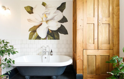
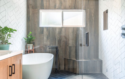
“She loves to soak in a bathtub, and their old tub was a small drop-in that wasn’t comfortable. And their shower was so cramped that they didn’t like using it,” West says. She placed the freestanding tub under the windows and designed the rest of the floor plan from there. She had enough room for a generous shower stall on one side and the large double vanity the couple wanted on the other, with the toilet tucked between the vanity and the wall.
The tub sits on a platform that is a continuation of the shower’s curb. This gave it a strong presence in the room. “I wanted to reinforce this as a designated area,” the designer says. Thanks to carefully mitered waterfall edges on the platform, the tub looks as if it is sitting on a solid block of stone.
Browse freestanding bathtubs in the Houzz Shop
West was familiar with this sculptural freestanding bathtub, which is slightly shorter than average. It’s a good fit for a space where every inch counts.
“I knew this tub was very comfortable, so I proposed it to them,” she says. It has a simple contemporary shape; the polished nickel faucet has a more traditional silhouette and finish.
“I knew this tub was very comfortable, so I proposed it to them,” she says. It has a simple contemporary shape; the polished nickel faucet has a more traditional silhouette and finish.
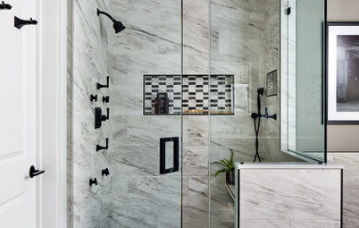
While Mom wanted a place to soak, Dad’s must-have was a shower bench. West designed one that floats off the wall and extends the width of the stall. Wrapping it in tile that matched the shower surround created a virtually seamless look that plays off the blocky appearance of the tub platform. A large shower nook above the bench continues the play of simple rectangular shapes.
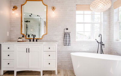
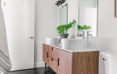
West used several tricks to make the bathroom seem larger. The light wall color and a clear glass shower enclosure keep the room feeling open. Two extra-high custom mirrors reflect the room’s warm, natural light and emphasize its verticality. “You see these mirrors right as you walk in the room, and it makes the space feel twice as big,” she says.
And by sticking with one large-format tile for the main floor, walls and shower bench, she reduced visual breaks. “Using this tile this way really expanded the space visually,” she says.
Paint: Agreeable Gray (walls) and Mega Greige (vanity): Sherwin-Williams
Shop for a bathroom mirror
And by sticking with one large-format tile for the main floor, walls and shower bench, she reduced visual breaks. “Using this tile this way really expanded the space visually,” she says.
Paint: Agreeable Gray (walls) and Mega Greige (vanity): Sherwin-Williams
Shop for a bathroom mirror
The tile is porcelain with digitally printed vein patterns that mimic natural stone. Its neutral colors add warmth, while its striated pattern leans contemporary.
One place where West needed to create a visual break was on the shower floor, which is tiled in charcoal-colored penny rounds. “We needed to add some contrast to all of that other tile,” she says.
Find a bathroom remodeler in your area
One place where West needed to create a visual break was on the shower floor, which is tiled in charcoal-colored penny rounds. “We needed to add some contrast to all of that other tile,” she says.
Find a bathroom remodeler in your area
More contrast comes in through the window treatments. “We chose this fabric for the Roman shades to keep the room from feeling too sterile or contemporary,” West says. “It’s kind of a modern geometric take on ikat.”
The geode framed in a shadow box adds a touch of nature and an extra little punch of dark color.
The geode framed in a shadow box adds a touch of nature and an extra little punch of dark color.
Keeping room features streamlined and simple reduced visual clutter, but a few key accents, such as the classic faucet silhouettes and the mix of metals, add traditional charm to the room.
“The vanity is so neutral and soft that we added some contrast with the marble-and-brass knobs,” West says. This detail is repeated 12 times because West designed the cabinet doors to look like a series of drawers.
“The vanity is so neutral and soft that we added some contrast with the marble-and-brass knobs,” West says. This detail is repeated 12 times because West designed the cabinet doors to look like a series of drawers.
Like the shower floor and vanity hardware, the Caesarstone counter in Piatra Grey brings in contrast. Though this was the dream material West originally chose, it was way out of the budget. That is, until one lucky day when she came across a leftover scrap of it at her favorite secret slab yard. “It was a miracle. Sometimes the stars just align and everything comes together,” she says.
More on Houzz
Read about bathroom design
Browse photos of bathrooms
Find a local bathroom designer
Shop for bathroom products
More on Houzz
Read about bathroom design
Browse photos of bathrooms
Find a local bathroom designer
Shop for bathroom products


Sponsorizzato
Ricarica la pagina per non vedere più questo specifico annuncio

Sponsorizzato
Ricarica la pagina per non vedere più questo specifico annuncio
Bathroom at a Glance
Who uses it: A couple who have four children
Location: Kaysville, Utah
Size: 124 square feet (12 square meters)
Designer: Andrea West Design
At 124 square feet, the bathroom was far from compact, but having to fit in a freestanding tub, a generous separate shower stall and a double vanity in a way that felt airy and spa-like was West’s biggest challenge. It meant visually expanding the room with light and reflection and well-edited design elements. The result is a mix of styles — clean and contemporary bones warmed up by a few key traditional and eclectic touches.
Find a local interior designer on Houzz