


Commenti
8 Purple Paint Colors That Work Well in a Kitchen
See how this versatile hue plays with gray and other undertones to give a kitchen a stylish accent color
Jennifer Ott
25 maggio 2021
I’ve been noticing more people interested in using uncommon colors in their kitchens. And that’s refreshing. If our recent story on six attractive pink paint colors for the kitchen aroused your interest, consider the unusual yet appealing sway of purple. Here are eight purple paint colors that work well.
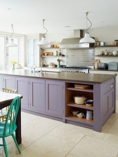
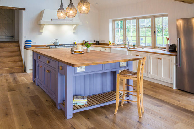
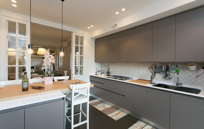
1. Muted Violet
What I love about purple hues is how well they mix with gray. Unlike blues and greens that can veer cold or gloomy as they become muted with gray tones, purple-grays tend to retain warmth and life.
The centerpiece of this charming kitchen is the beautiful subdued violet island cabinetry. This particular color is a nice midtone purple — not especially dark nor light — with just a touch of gray to tone it down from a more pure shade of purple.
Find an interior designer or decorator
For a similar look: Ash Violet by Sherwin-Williams is a shade of purple that plays well with a variety of other hues, from warm reds and yellows to cooler blues, grays and greens. It’s a sophisticated color that’s in no way stuffy.
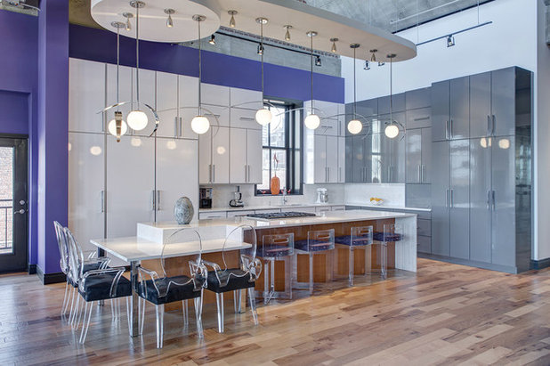
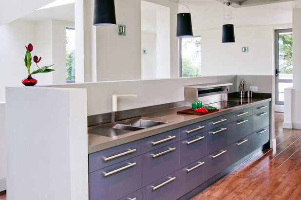
2. Cool Purple
A cool kitchen deserves a cool color and this spectacular contemporary kitchen gets a healthy dose of it. If you look at various shades of purple, you’ll notice some veer more blue and others pink-red. The former are what I refer to as “cool purples” and they pair really well with cool shades of white and gray. Balance is key, of course, so a warm element such as wood floors or cabinets keeps the space from going too cold.
Shop for bar and counter stools
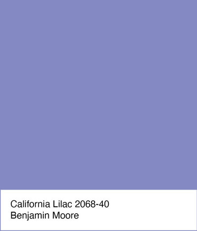
For a similar look: California Lilac by Benjamin Moore is a blue-purple hybrid that’s bright and cheery, making it an excellent candidate for an accent color in a modern or contemporary kitchen. Plus, as a cooler color, it works well for homes in warmer climates.
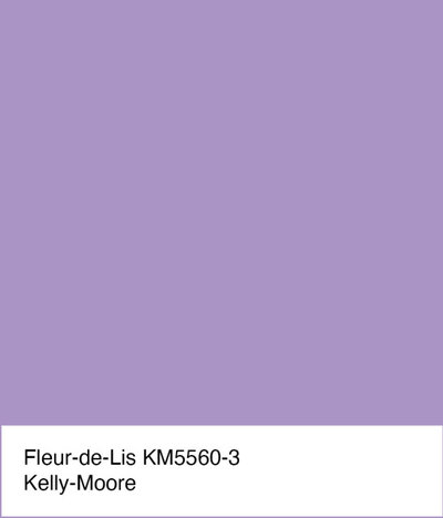
3. Warm Purple
This purple has pink rather than blue undertones, making it a warmer purple compared with the previous example. This touch of warmth makes it a great choice in an otherwise cool, white and bright kitchen.
This purple has pink rather than blue undertones, making it a warmer purple compared with the previous example. This touch of warmth makes it a great choice in an otherwise cool, white and bright kitchen.
For a similar look: Those residing in cooler climates might favor a warmer purple over the previous cool example. Fleur-de-Lis by Kelly-Moore is a purple shade with pink undertones, which takes the chill off.
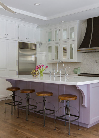
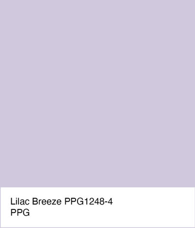
4. Light Lilac
Traditional kitchens need not stick to traditional color schemes. This soft shade of lilac purple is as pretty as it purpose-serving. It provides contrast in this mostly white kitchen, but with a soft touch rather than a heavy hand.
If the island was painted white in this kitchen, it wouldn’t stand out as well. A soft wash of color transforms it into a focal point.
For a similar look: Lighter than the previous example, Lilac Breeze by PPG is a soft and pretty purple that works well in any style of kitchen, from traditional to contemporary.
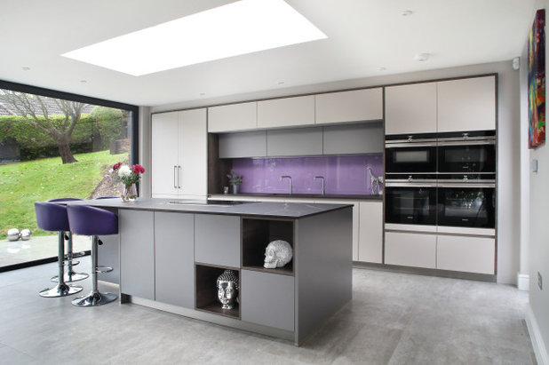
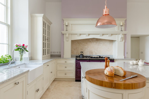
5. Soft Orchid
Even lighter than the last example, this soft purple blush hue adds just a touch of color and is another example of successfully using less-traditional colors in traditional and transitional spaces.
I would argue that while the stunning plum-colored range is the focal point of this beautiful kitchen, the soft pinkish-purple accent wall serves a solid supporting role.
For a similar look: Purpling Dawn by Valspar is a sweet hue that’s perfect for anyone looking to add some color to the kitchen while keeping the space light and bright.
6. Purple-Periwinkle
I speak a lot about my childhood love of periwinkle — my favorite crayon color from way (way!) back in the day. Named for the flowering plant with pretty flowers that run from warm blue to cool purple, periwinkle brings a fun and fresh vibe into a kitchen.
Periwinkle shades tend to be more vibrant, with less gray and more pure purple and blue tones, so they’re best used to clad architectural elements that you want to capture the eye.
For a similar look: This is no wallflower hue, so in most cases a little bit of Dahlia by Sherwin-Williams is all you need to create a stunning focal point in the kitchen.
7. Gray-Grape
If periwinkle strikes you as too vibrant, take a look at purple shades that have a healthy dose of gray in them, such as the color applied to these base cabinets. It’s not a neutral hue but it has enough gray in it that it doesn’t come on too strong.
If periwinkle strikes you as too vibrant, take a look at purple shades that have a healthy dose of gray in them, such as the color applied to these base cabinets. It’s not a neutral hue but it has enough gray in it that it doesn’t come on too strong.
For a similar look: A shade like Violet Stone by Benjamin Moore is a nice compromise between light and dark and vibrant and neutral. It’s just right.
8. Deep Purple-Gray
Dark gray has been a popular accent color for a while now, but it’s starting to get nudged out by warmer hues such as bronze and purple-grays. This dark gray-purple hybrid really defines this modern kitchen and provides a bit of pleasing contrast in an otherwise white and light kitchen.
Dark gray has been a popular accent color for a while now, but it’s starting to get nudged out by warmer hues such as bronze and purple-grays. This dark gray-purple hybrid really defines this modern kitchen and provides a bit of pleasing contrast in an otherwise white and light kitchen.
For a similar look: A heavily toned-down purple like Solitaire by Behr can be called upon to serve as a neutral. If you’re seeking a dark accent hue but would rather not tap black or grays, a deep purple-gray like this is a good option to consider.
Your turn: Which shade of purple is your favorite? Tell us in the Comments.
More on Houzz
Read more Color stories
Hire a kitchen remodeler
Shop for kitchen products
Your turn: Which shade of purple is your favorite? Tell us in the Comments.
More on Houzz
Read more Color stories
Hire a kitchen remodeler
Shop for kitchen products
Articoli correlati
Lavorare con i Pro
Quale Professionista Chiamare in Base al Lavoro che Devi Fare
10 profili di professionalità legate alla casa e i loro ambiti d'azione visti da vicino
Leggi Tutto
Stili e tendenze
Styling vs Realtà: Ante Senza Maniglie, Sì o No?
Ovunque vediamo frontali senza maniglie che si aprono con un tocco. Ma quali sono le opinioni sull’uso quotidiano?
Leggi Tutto
Bagno
Come Ristrutturare il Bagno da Zero
di Sara Pizzo
Una guida alla ristrutturazione del bagno per capire chi chiamare, quale budget impegnare e che tempi prevedere
Leggi Tutto
Camera da letto
10 Soluzioni da Copiare Se avete una Camera da Letto Piccola
Idee intelligenti da realizzare con l'aiuto di un professionista per avere ciò di cui hai bisogno in pochi metri quadri
Leggi Tutto
Ristrutturare
Quanto Tempo Serve per Ristrutturare La Casa Stanza per Stanza
di Sara Pizzo
Guida ai tempi necessari per la ristrutturazione della casa, divisi stanza per stanza
Leggi Tutto
Parla l'esperto
Le 10 Regole per Progettare la Cucina
Abbiamo chiesto ai professionisti di Houzz le 10 regole fondamentali per realizzare una cucina al meglio
Leggi Tutto
Pareti
Come Scegliere il Giusto Tono di Bianco
di Sara Gravina
Consigli e indicazioni su come scegliere il tono di bianco più adatto alla propria casa
Leggi Tutto
Soggiorno
A Che Altezza Appendere la TV in Soggiorno?
di Sara Pizzo
Ecco a che altezza posizionare lo TV in soggiorno per una visione confortevole. Scopri tutte le misure in base alla TV
Leggi Tutto
Lavorare con i Pro
5 Domande Essenziali per Scegliere un Architetto
Come può aiutarvi un architetto quando si deve ristrutturare casa? Ecco come sceglierlo e come si lavora con lui
Leggi Tutto
Cucina
Che Dimensioni Deve Avere la Cucina per Inserire un'Isola?
di Sara Gravina
Scopri le dimensioni e le misure minime per poter avere comodamente un'isola in cucina
Leggi Tutto